Client & Sector
Bravus Fitness
Health & Fitness
Project Objective
To completely reinvent Bravus and to do it “the right way” from the beginning. Enable the company to increase revenue, meet changing objectives, and seize new opportunities.
Deliverables
Brand Strategy
Brand Identity Design
Print Design
Social Media Design
Digital & Web Design
Apparel & Merchandise Design
Other Collateral
Year
2023
Bravus trusted Groundwork to reimagine their business from the ground up.

Bravus Fitness & Nutrition—Guiding clients forward through the brave journey of changing their lives for better health
01. Strategy
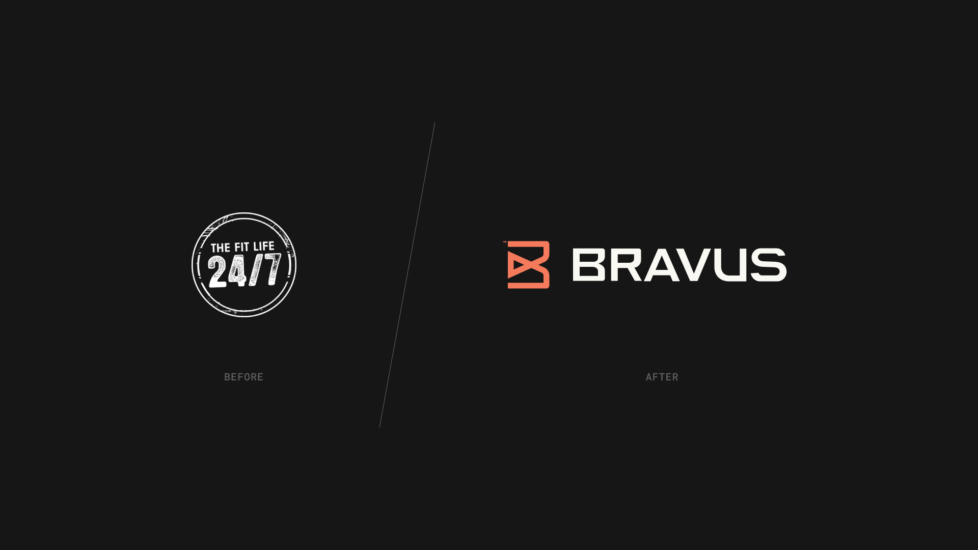
Grace & Andrew Bukowsky founded Bravus in 2012. Back then, it was known as The Fit Life 24/7. When the company began, the pair envisioned it as a way to grow their personal training practices.
As The Fit Life 24/7 scaled up and started to uncover new opportunities, it became clear that the company’s name and identity were holding it back. Driven by a desire to expand, serve a more diverse clientele, and offer a broader range of online services, Grace & Andrew began to explore rebranding. That’s where Groundwork comes in.
Andrew & Grace selected Groundwork to execute a top-to-bottom rebrand for their business because they wanted to “Do things the right way.” They expressed a need to “Get the project right” and to take a holistic approach.
At Groundwork, designing brands from the ground up is the most important thing we do. For a project like Bravus, “getting it right” means starting at the beginning with brand strategy.
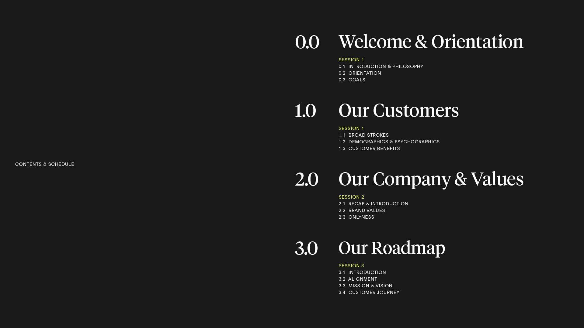
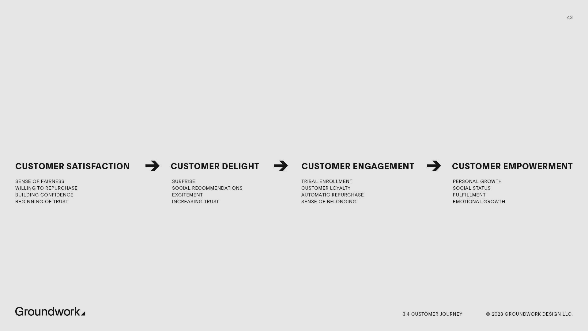
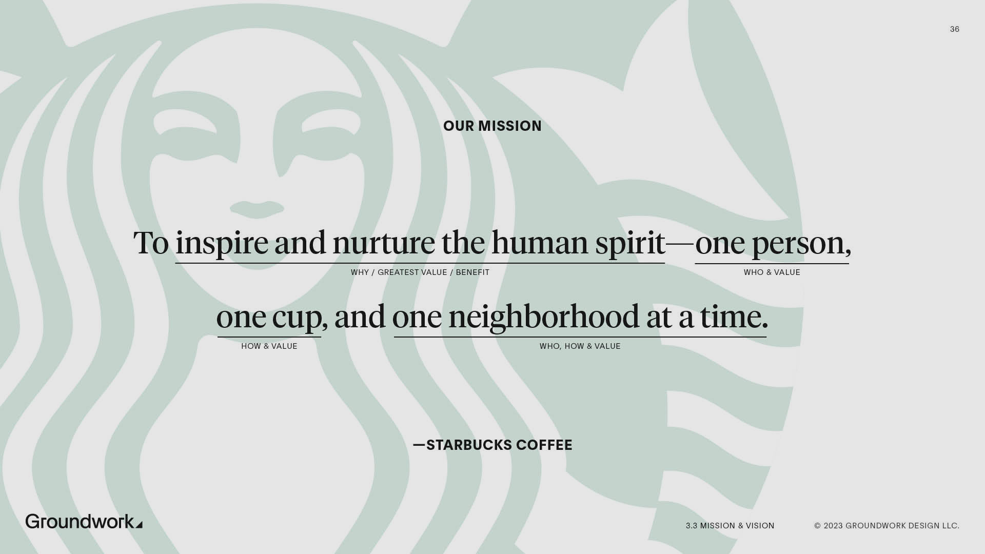
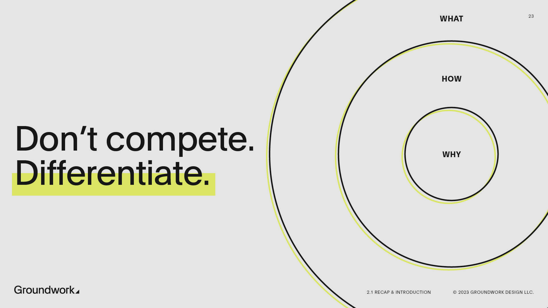
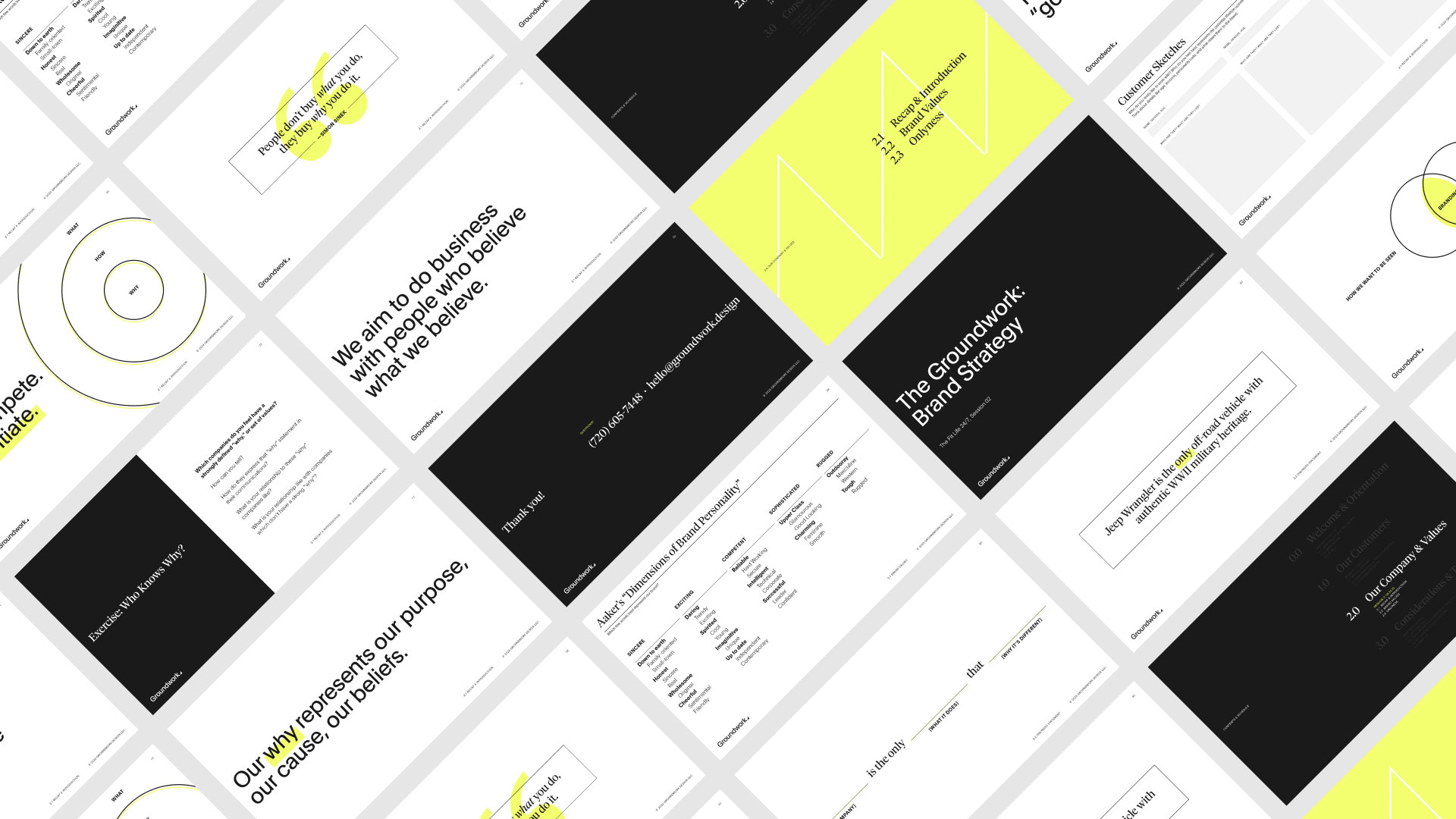
Bravus is the only complete, step-by-step fitness partner whose transparent and individualized mentorship transforms people’s outlooks to create lasting lifestyle improvement.
Branding is not logo design. A brand is a person’s gut feeling about a product, service, or company. That powerful gut feeling is what we’re after, not a logo, or a color palette, or a typeface. Those elements are the shorthand we use to represent a brand visually, but they are not the brand itself.
We can’t force our audience to have a certain gut feeling. But if we understand what we’d like that gut feeling to be, we can take actions that guide our audience to feel that way. This understanding-based discovery process is called brand strategy. It’s how we lay the groundwork for great brands, and our namesake.
If we’re trying to create a gut feeling, it makes sense to start where that gut feeling does. For us, strategy begins with people. When we understand who we’re for, why we do what we do, and where those ideas intersect, we have a brand ready to grow from the ground up.
Bravus mission & purpose, strategically developed by Groundwork
To build people up, improving their outlooks for better health and fitness, one individualized roadmap at a time.
02. Identity
Where brand strategy defines the problem, exploration begins to solve it. We’re looking for concepts that tell the story of our brand. Tools like mood boards and rough concepts allow us to zero in on what works best. We refine the more promising ideas, discard the things that don’t fit our design criteria, and find our direction.
A successful brand identity should find its roots in mission, values, and audience. The concepts uncovered during strategy carry forward into visual expressions.
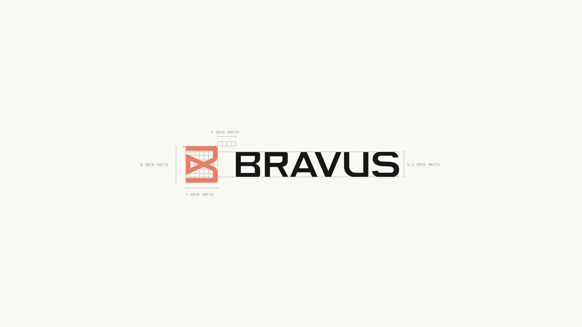
The Bravus icon needed the strength to stand alone in very exposed applications like apparel and merchandise. It needed to be flexible enough to represent the brand at any scale. Most importantly, it needed to communicate what Bravus is all about—moving people forward toward better health and fitness.
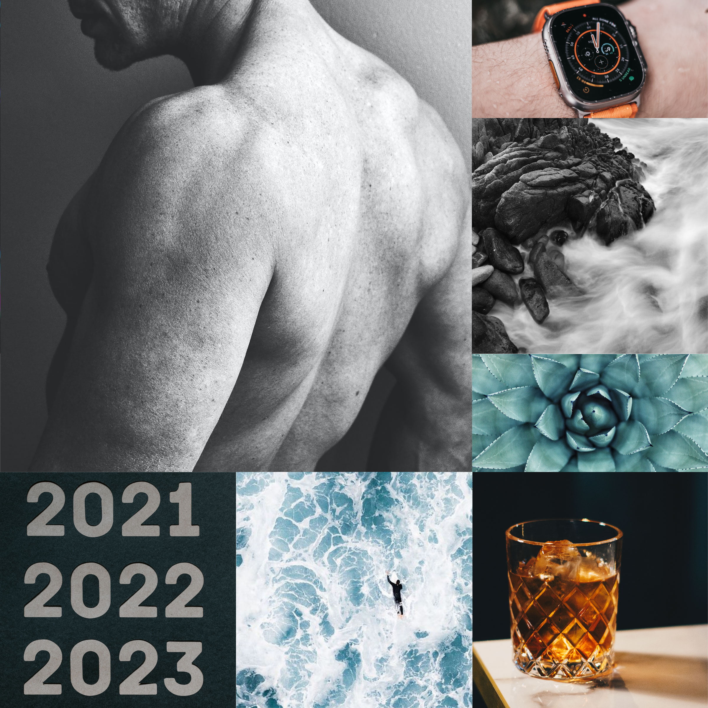

The mood boards which helped inspire Bravus
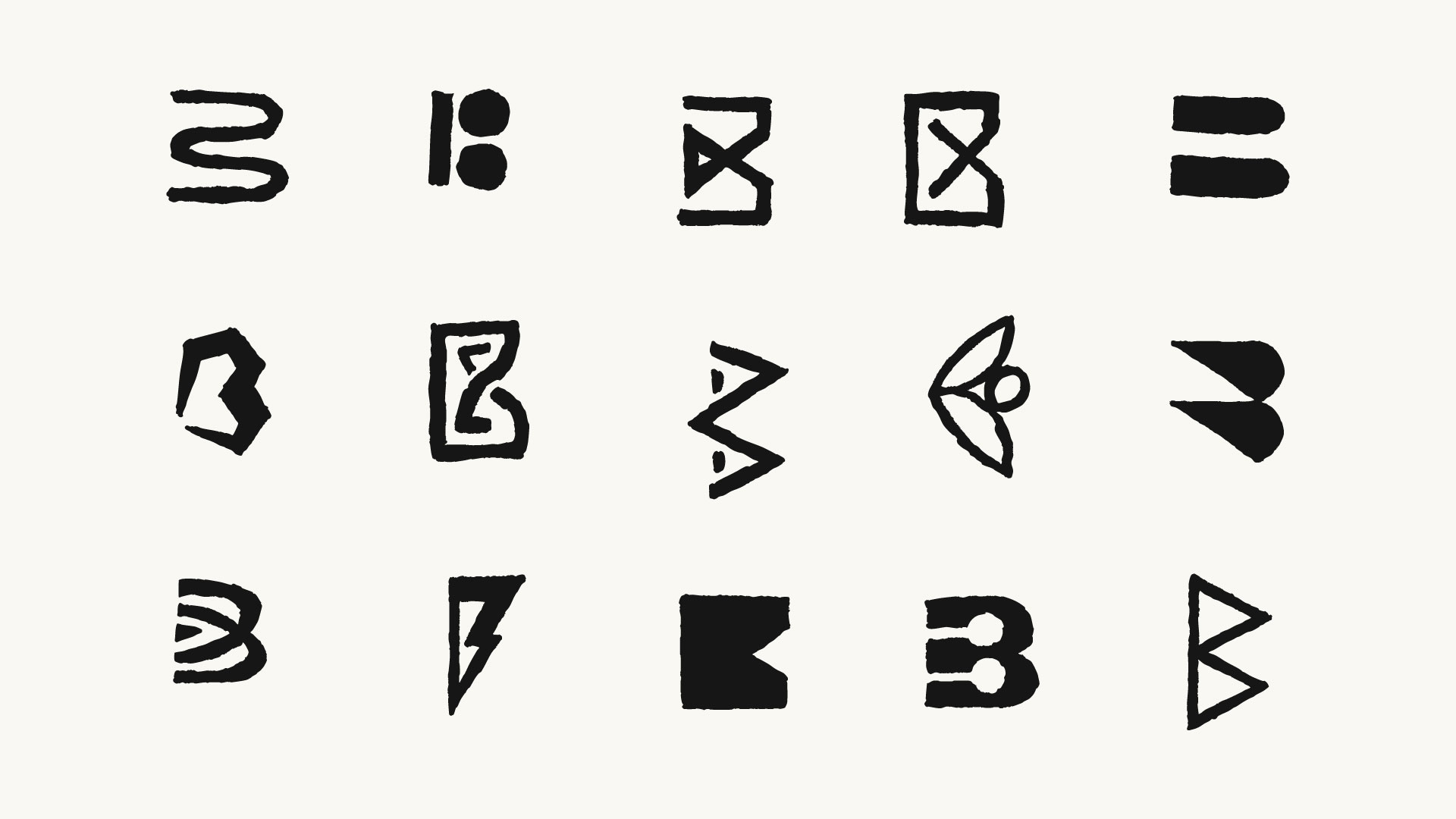
Early Concepts for Bravus
Concept: The Brave Journey of Fitness
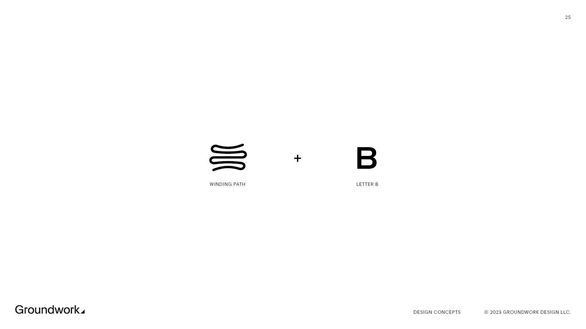
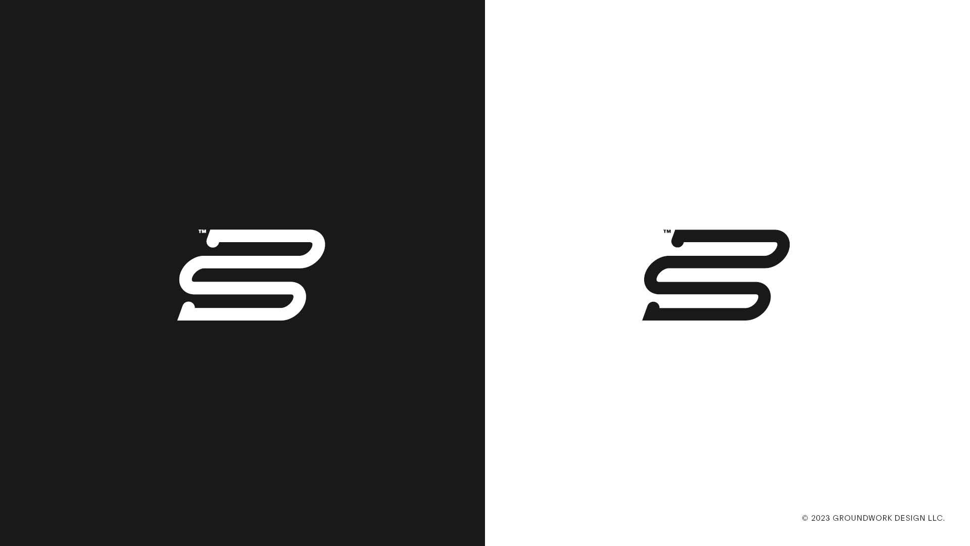
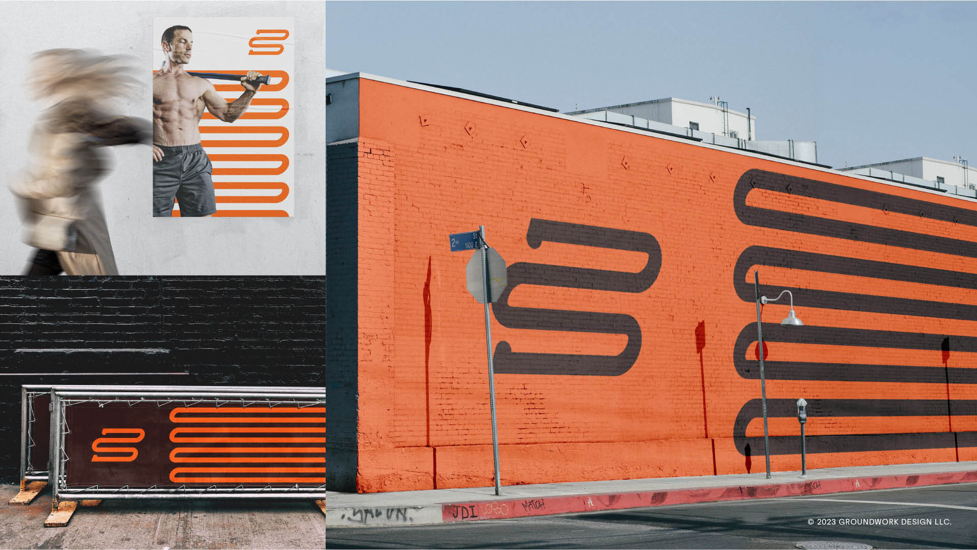
Fitness is not an act; it’s a habit. It takes bravery to dedicate yourself to the journey of becoming fitter. The flexible path element celebrates this brave journey. It can be used in various ways and morphs to fit each individual application, just like Bravus creates individualized roadmaps for its clients.
Concept: Effort in Motion
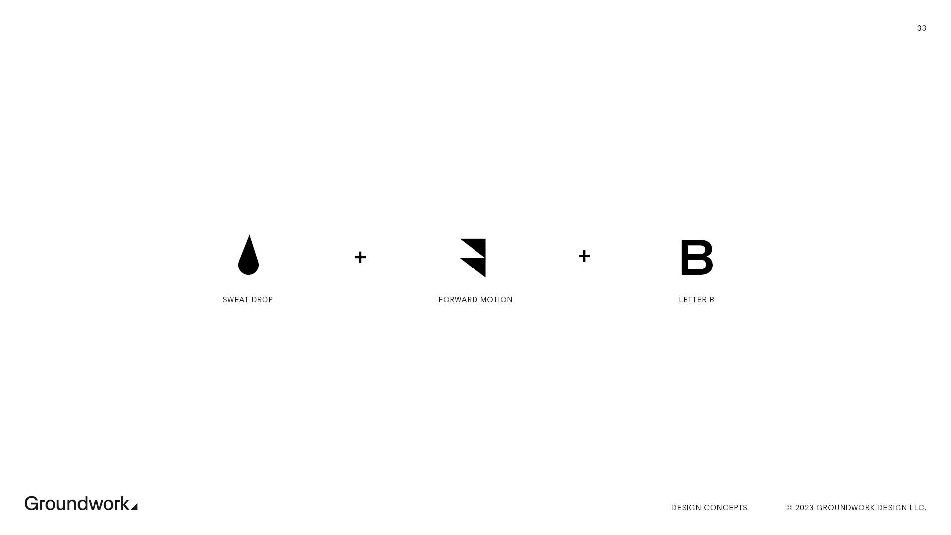
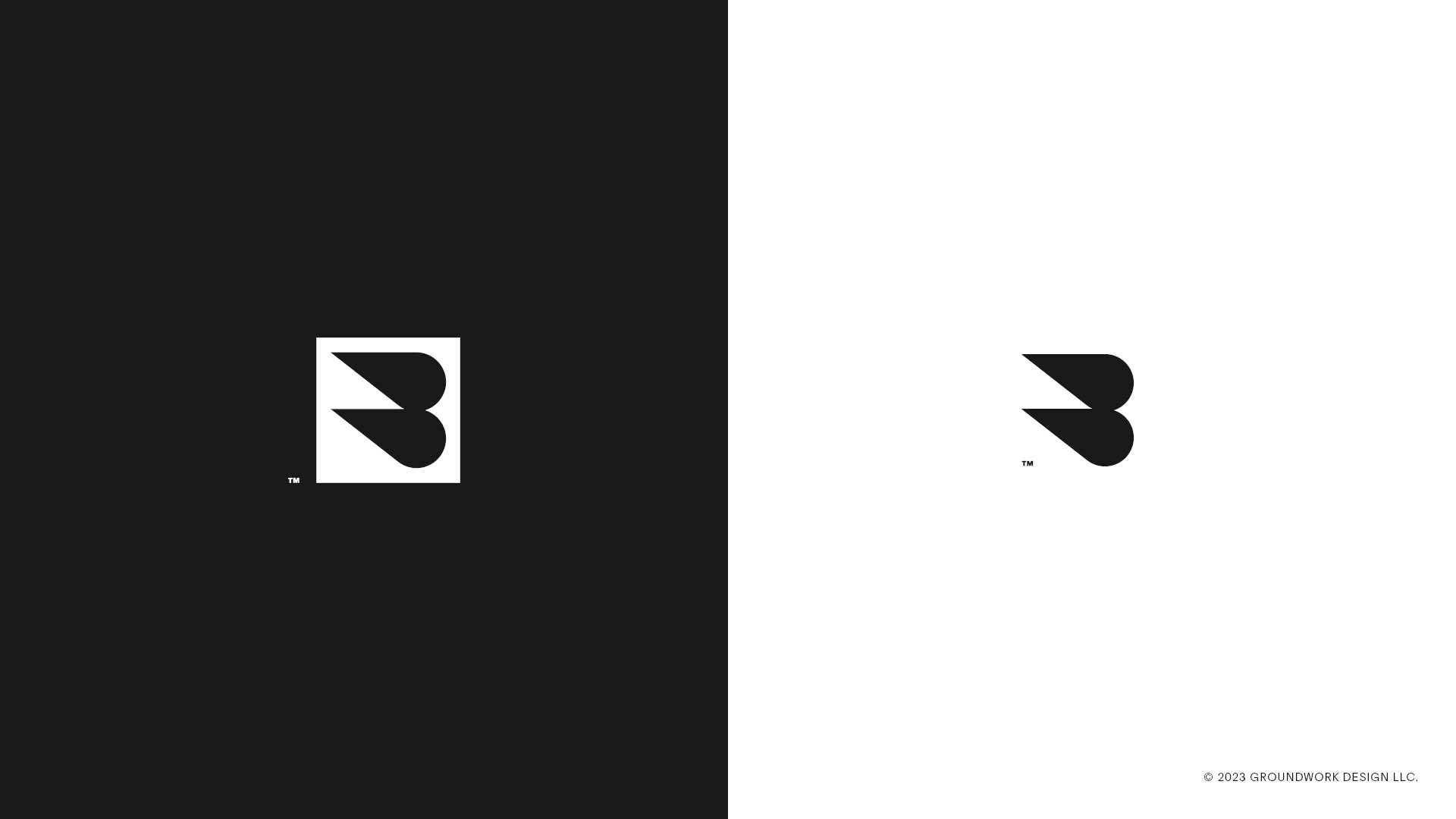
Heat and pressure make diamonds. When we work hard, our body sweats and strains under the effort. Fitness isn’t easy, but it’s worth it. This concept celebrates the effort, sweat, and movement it takes to become fitter.
Concept: Time & Commitment
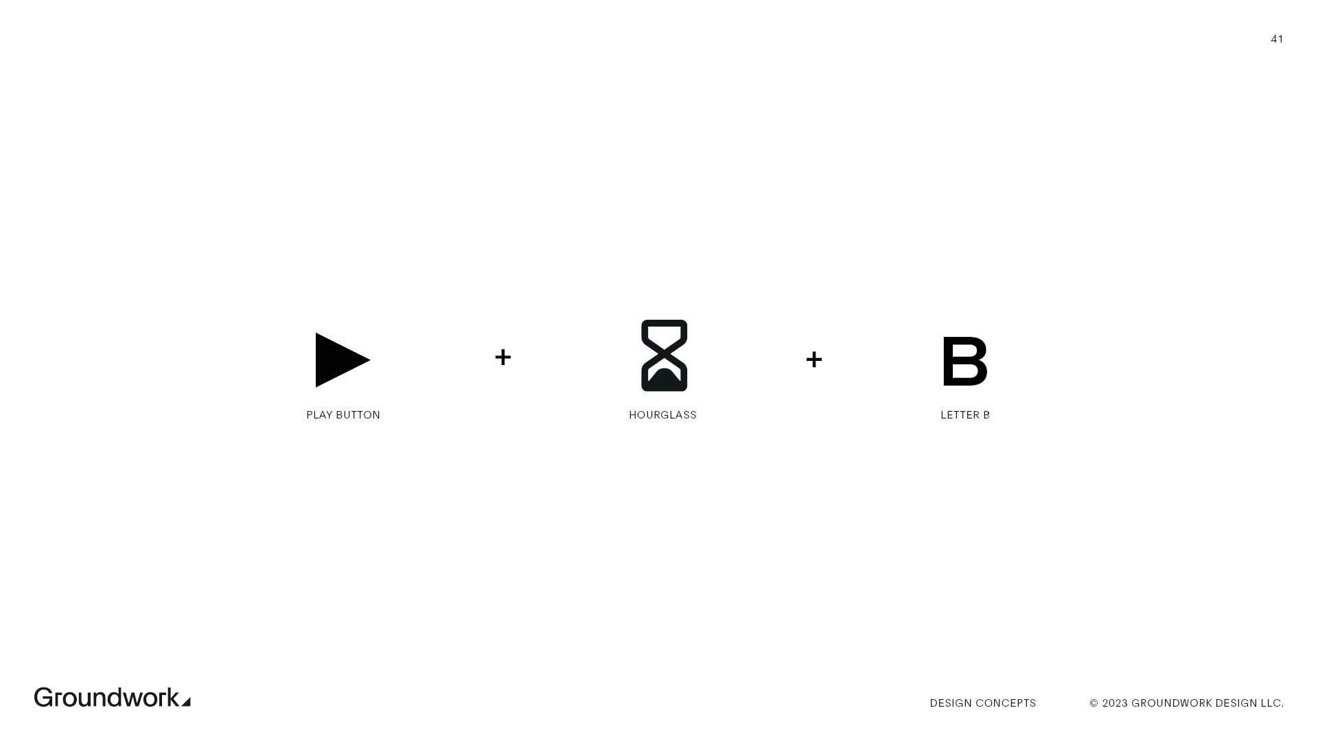
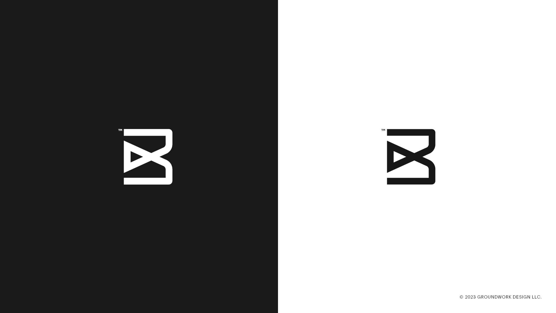
Anyone saying you can “get fit quick” is probably just trying to make a buck off of you. Fitness takes time. Patience and dedication move us bravely forward on our path to a fitter self.
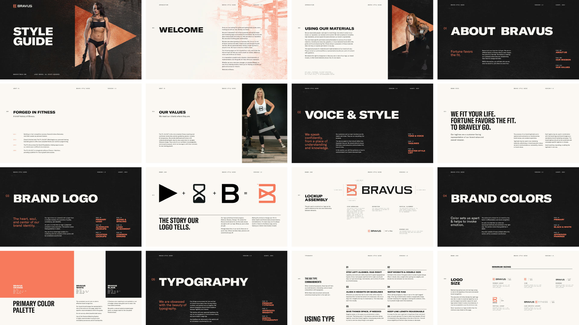
The Bravus Brand Identity
The logo Bravus selected symbolizes forward progress. Patience. Bravery. Change. The values the Bravus brand stands for are the same values we signify with our logo. What you see is what you get.
Changing your life for better health and fitness takes sincere bravery and dedication. It’s never easy, but it’s always worth it. Here’s to the Bravus logo and what it represents: helping people move bravely forward.



Segmentation
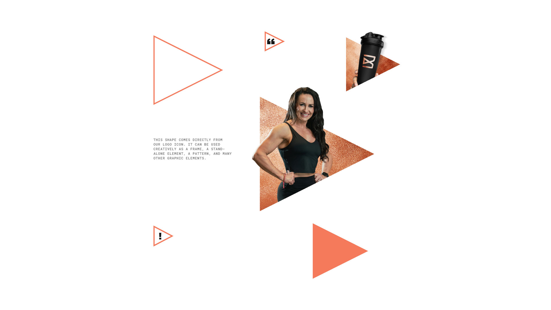
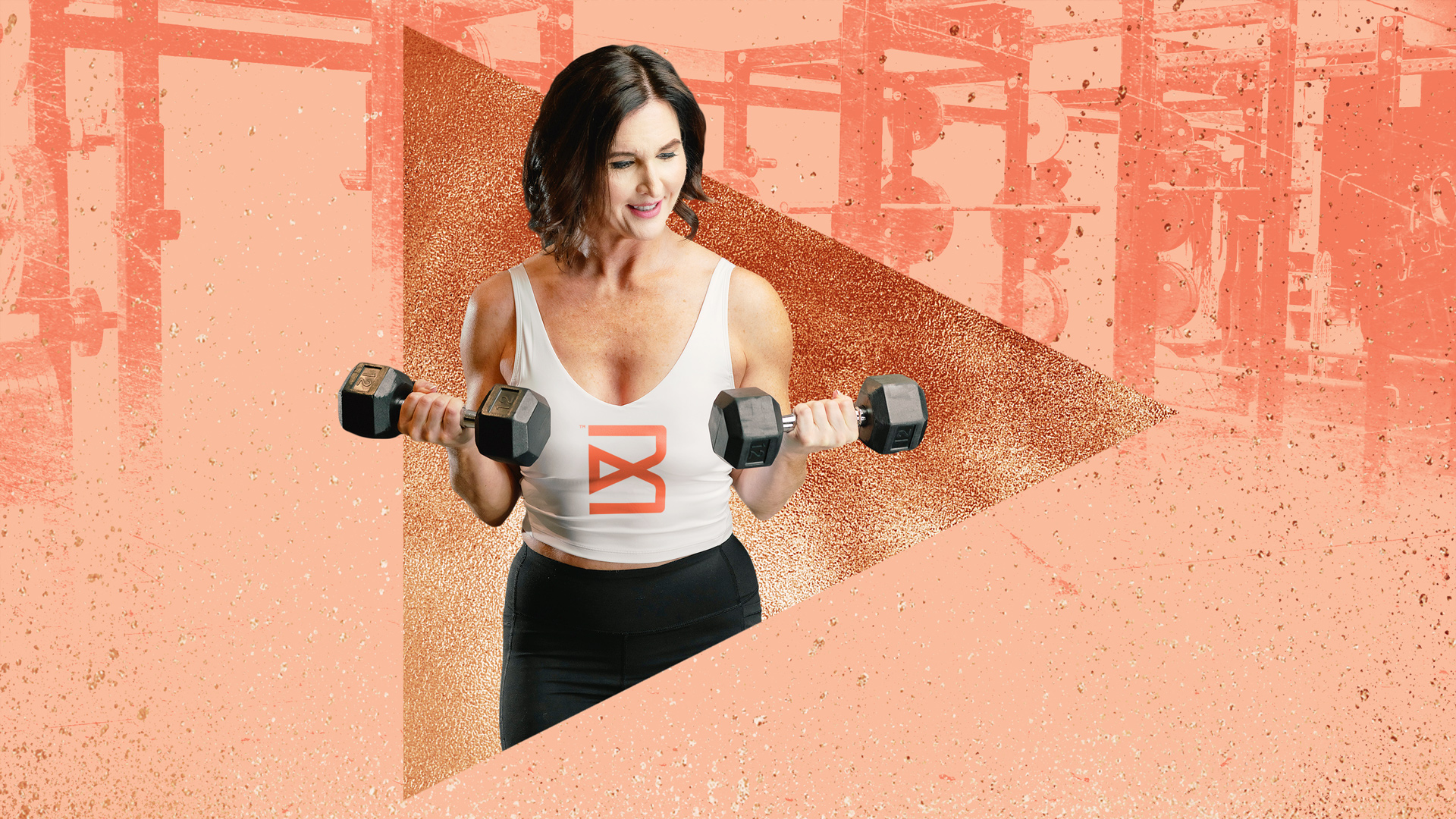
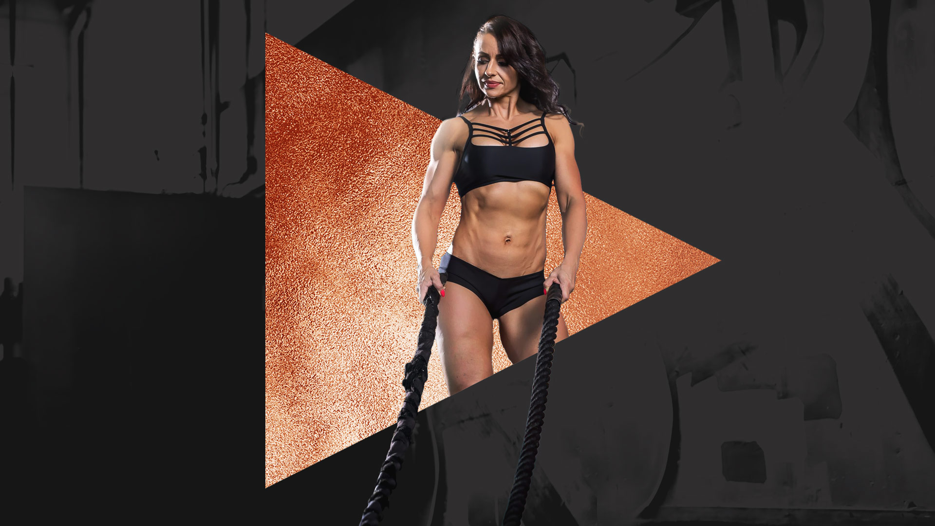
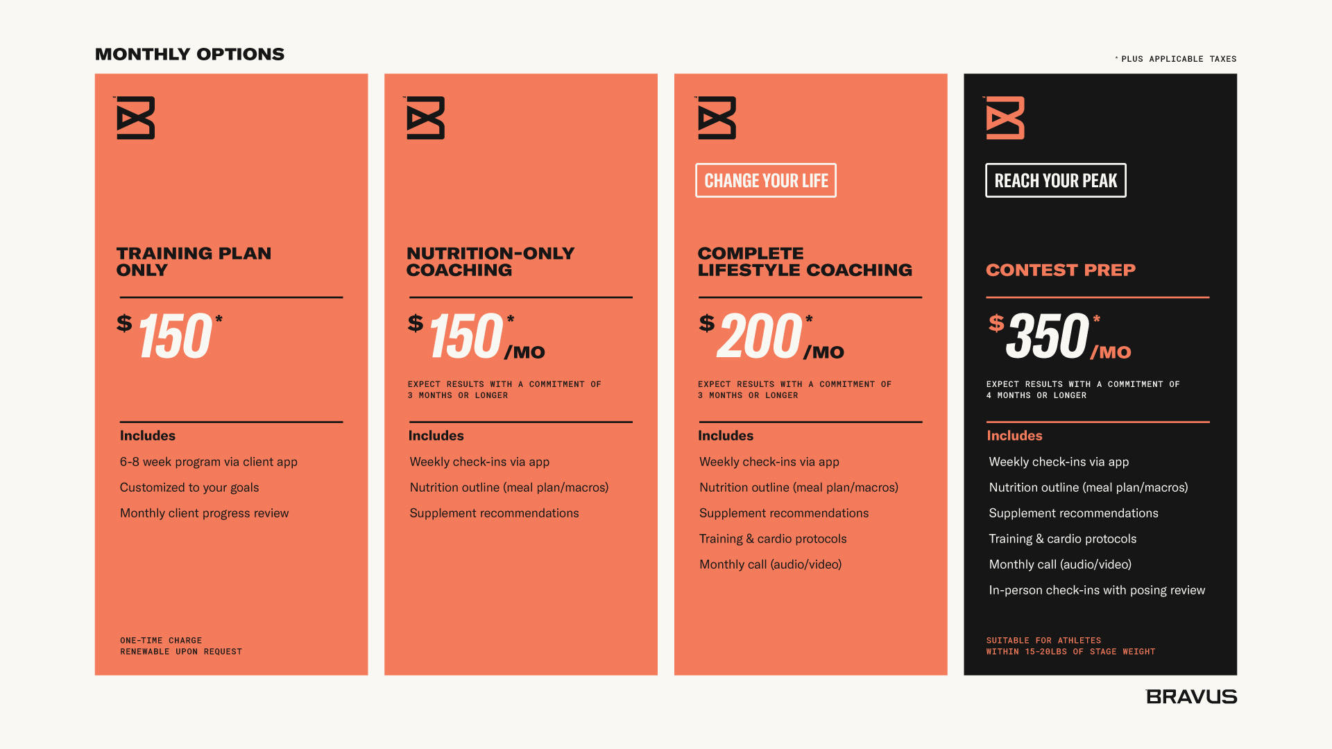
Groundwork designed the Bravus brand to be wide-ranging. The company needs to appeal to both lifestyle fitness clients and competitive athletes.
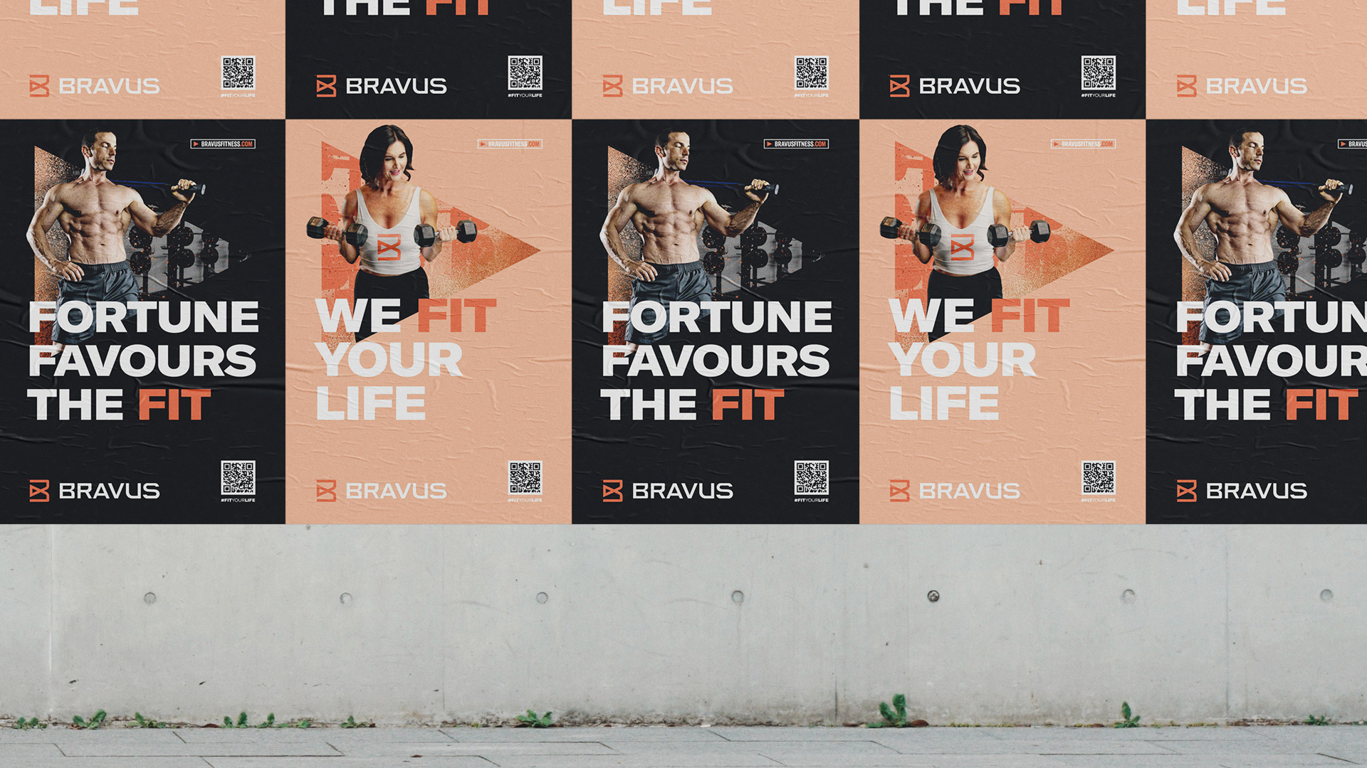
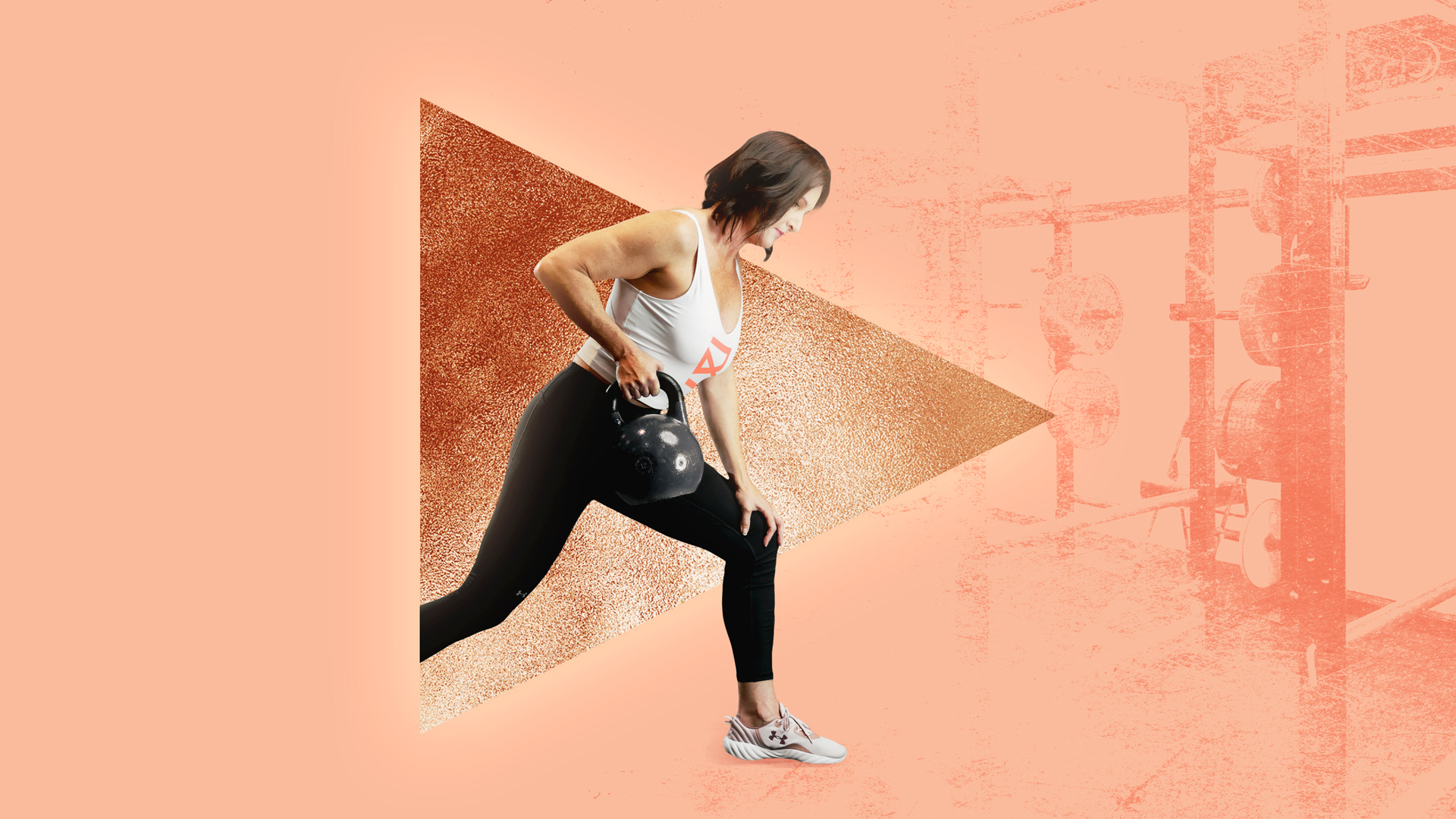
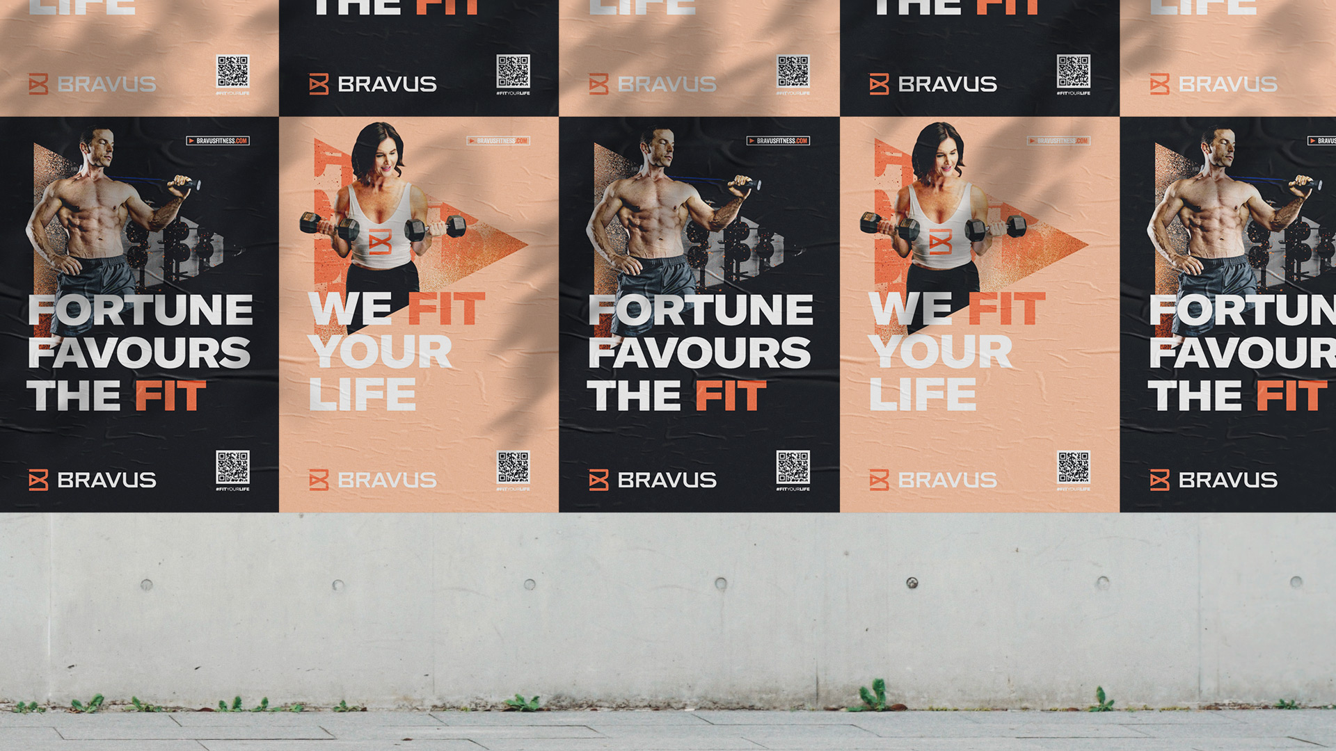
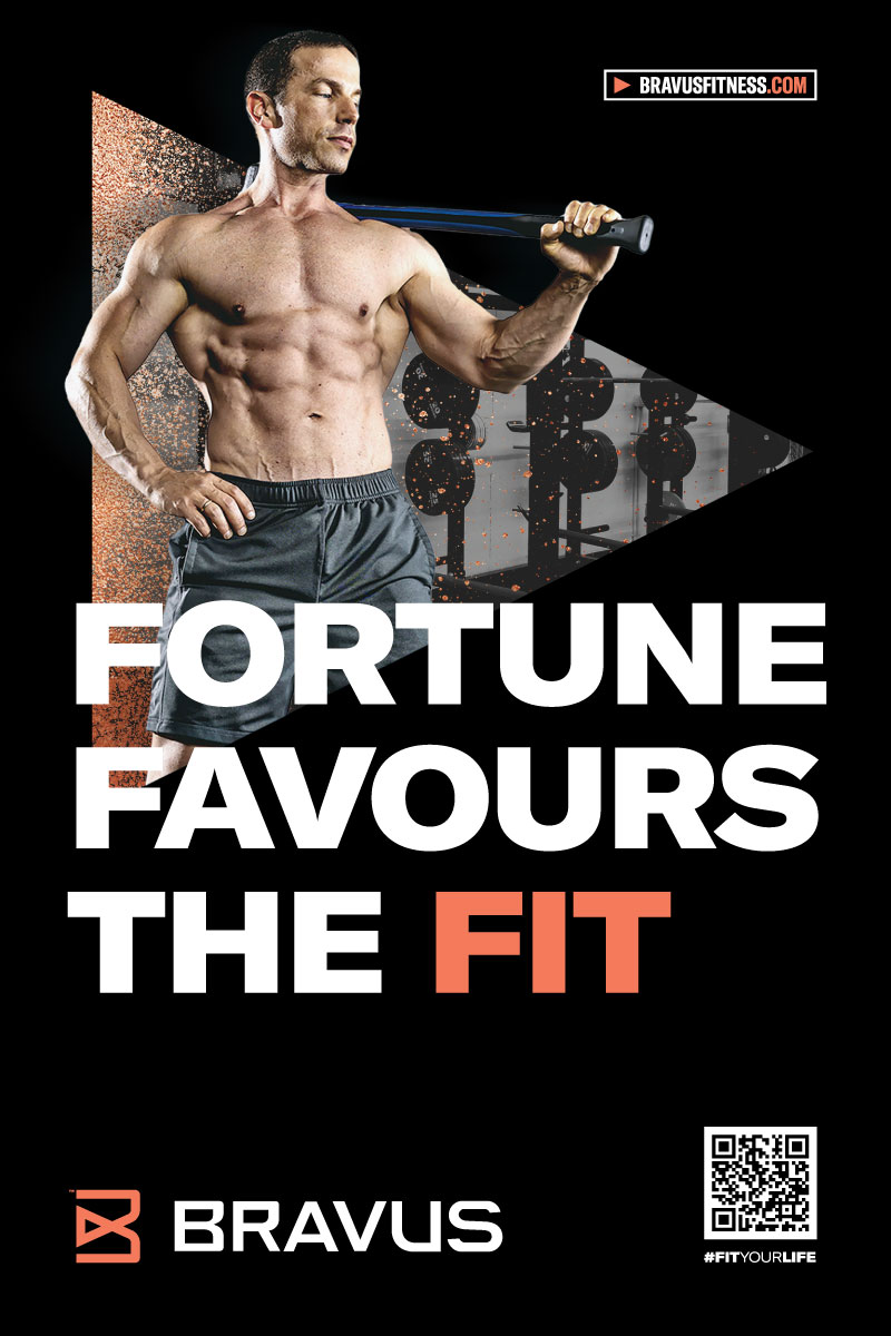
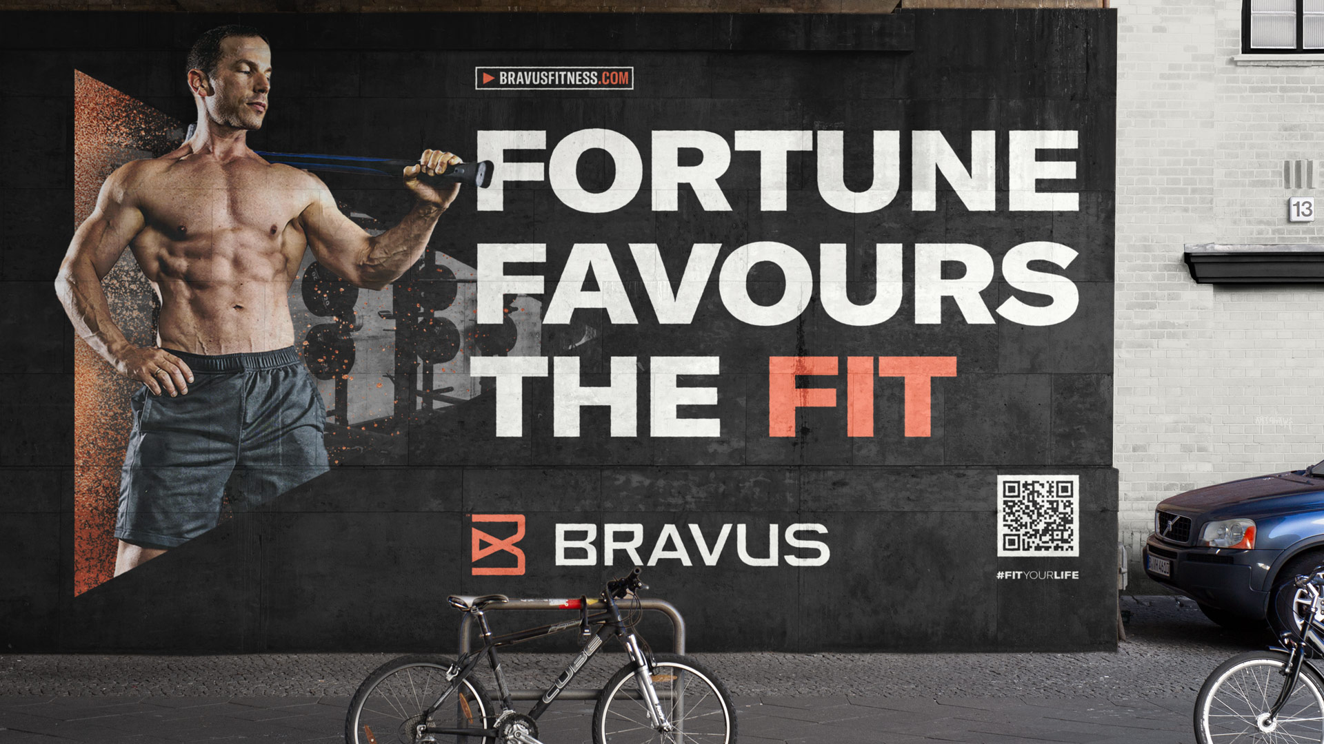
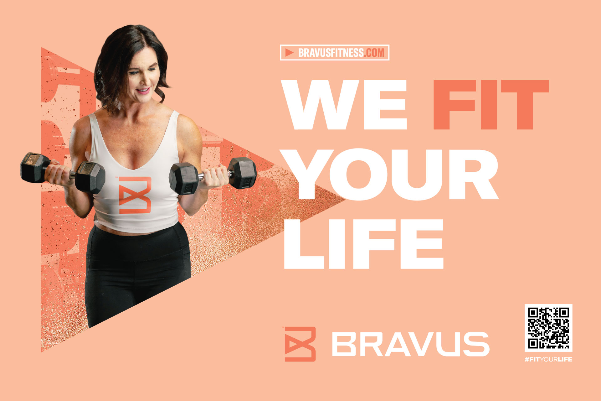
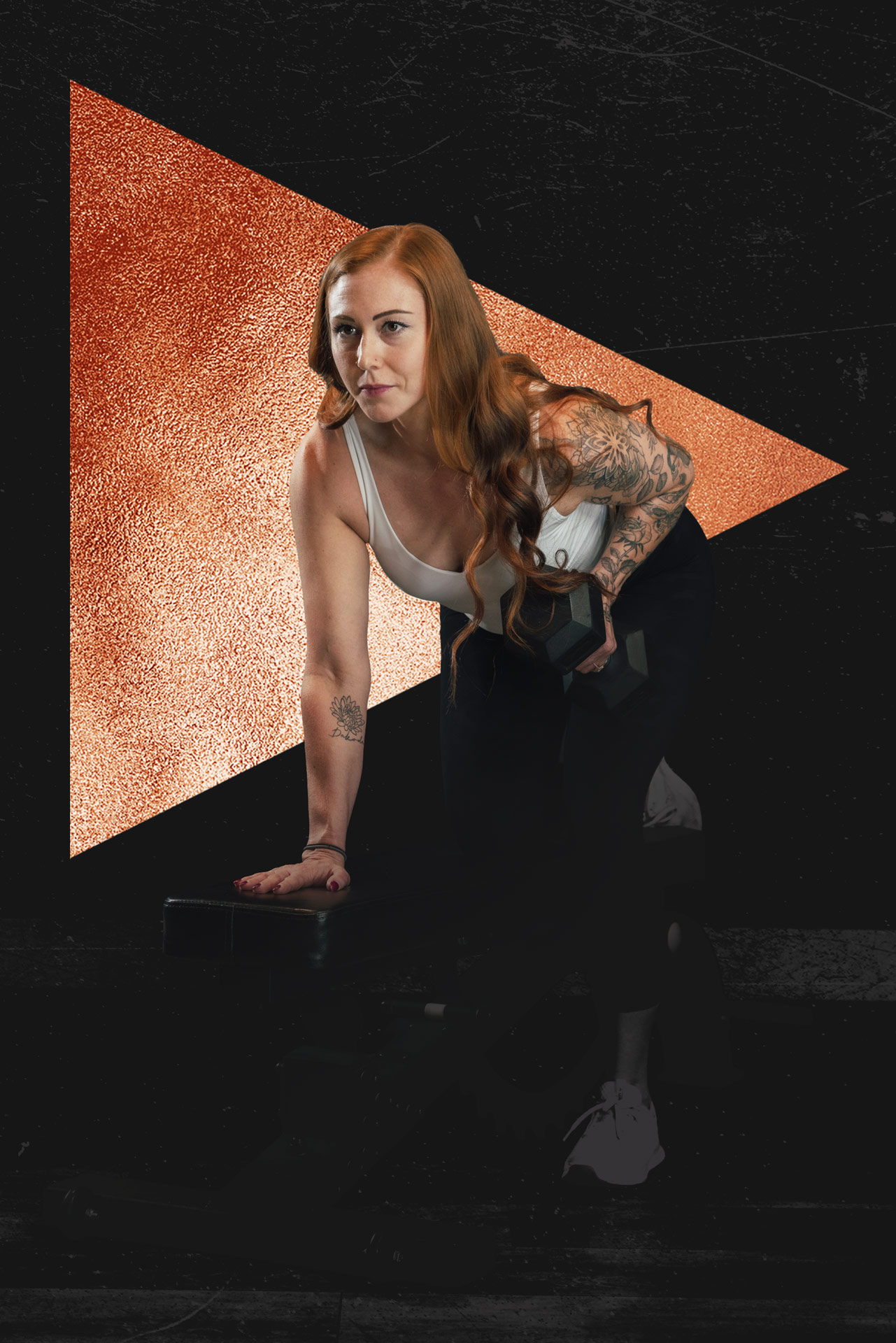
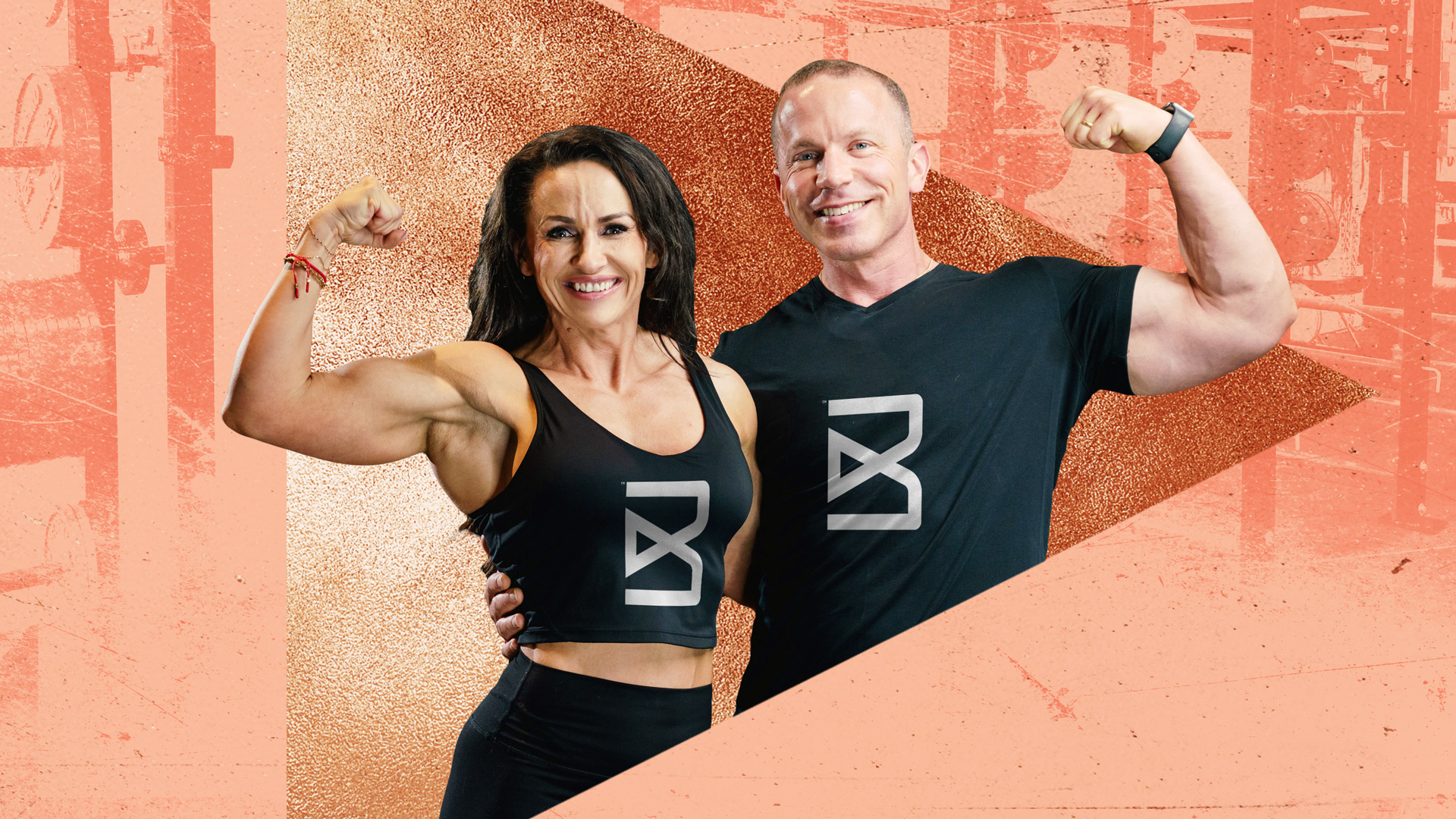
Lifestyle images are colorful and approachable. They convey the rewards of a fit life: better health and more energy. Competitive images are darker and more intense. They’re inspired by the hard work, sweat, and dogged determination it takes to be a champion.
Taglines
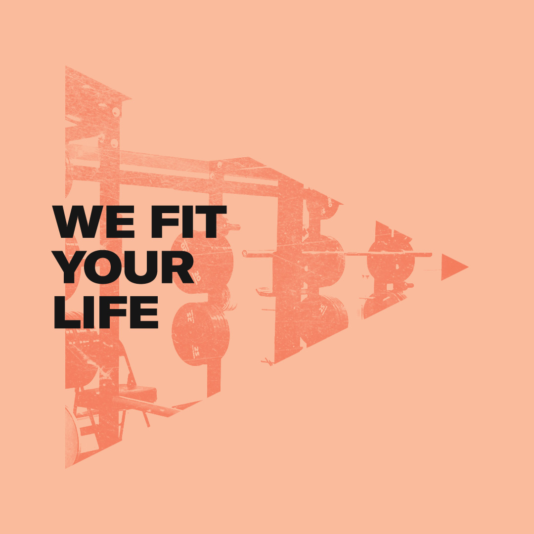
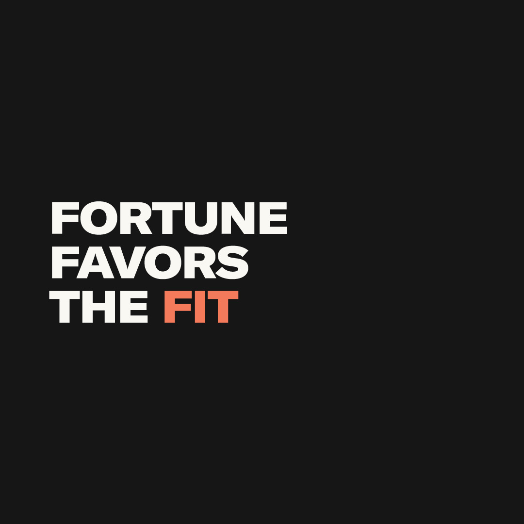
Taglines are a company’s purpose, tailored to connect to its audience. Groundwork wrote multiple taglines for Bravus to introduce the newly refreshed brand and to help target our diverse lifestyle and competitive audience segments.
03. Print & Collateral
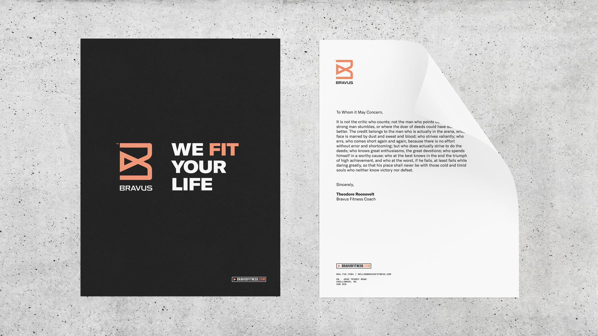
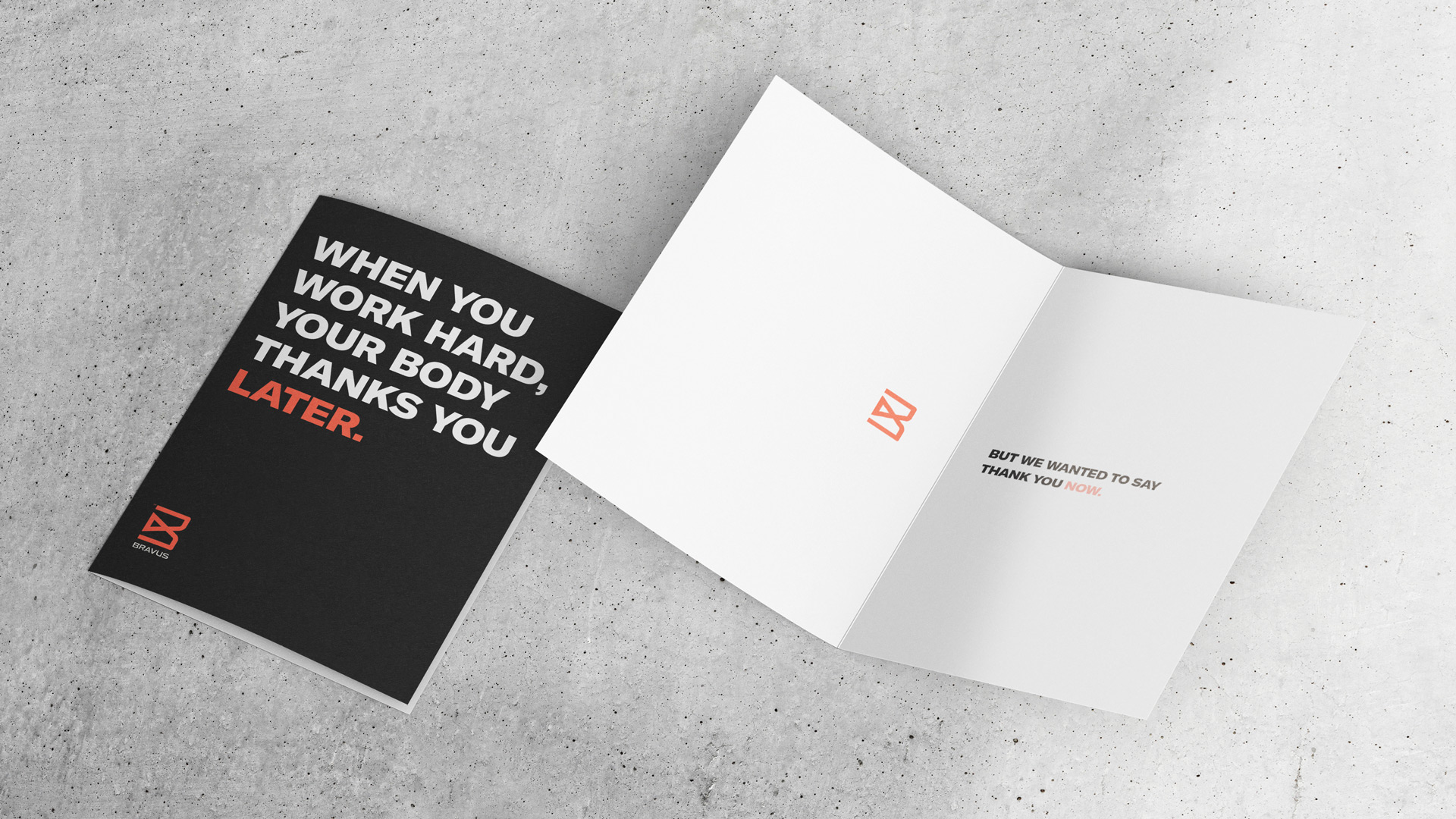
Collateral brings a brand to life. Often, these applications are how someone interacts with a brand for the very first time. We don’t take that responsibility lightly.
They must be simple, memorable, and powerful. They represent what a company stands for at just a glance. They are the materials that spark interest and elevate experiences. They send the signal that our brand might be for you.
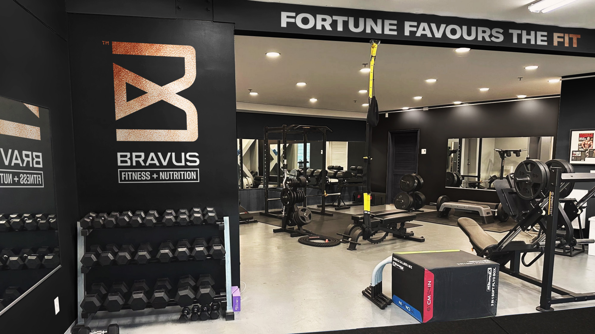
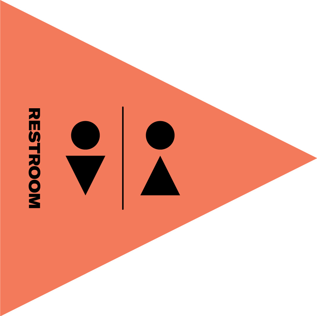
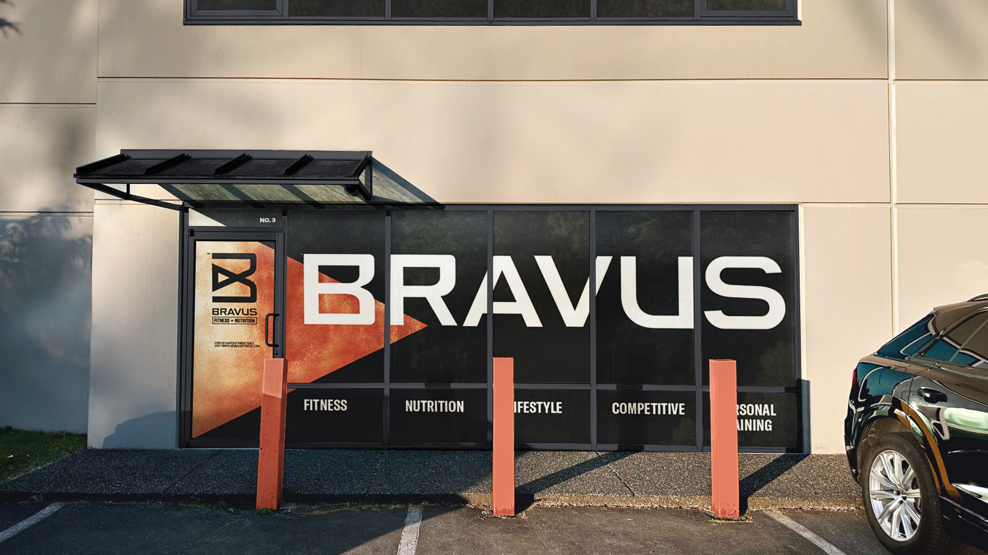
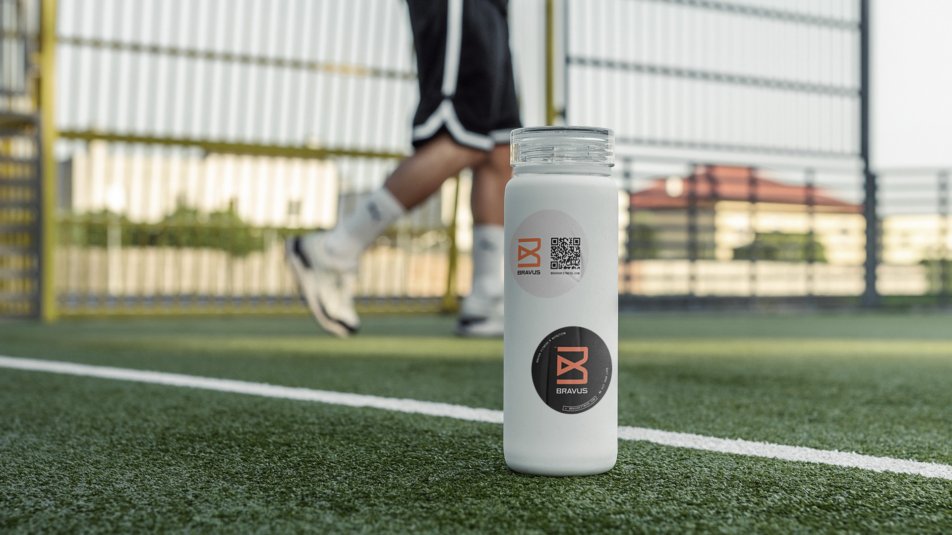
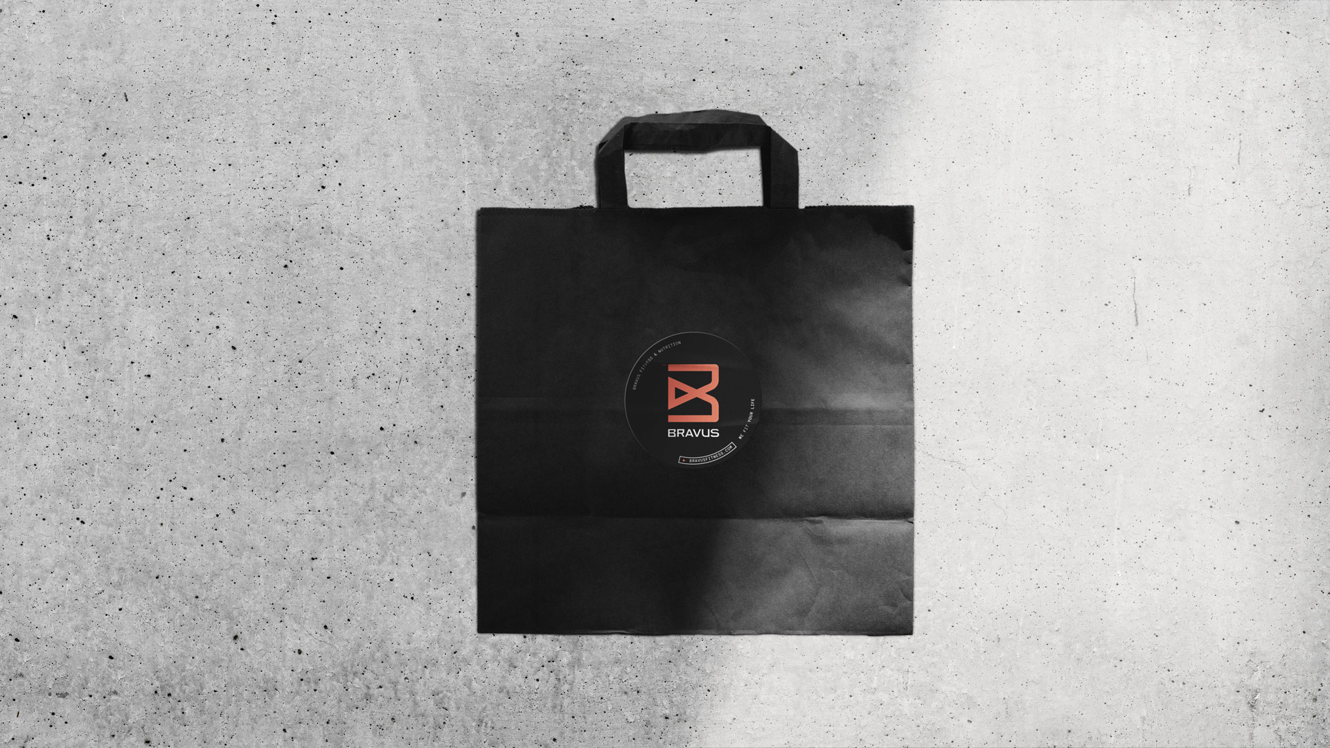
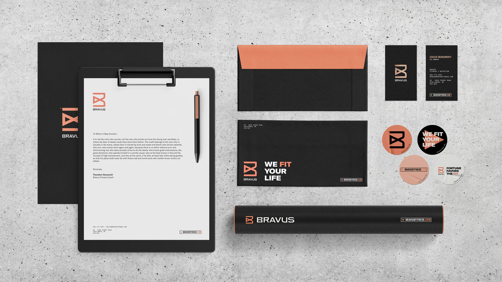
Groundwork designed a series of modular poster and mural layouts for Bravus. The brand’s lifestyle and competitive versions can be used independently if required, but they are beautiful together. We covered large formats like branded spaces, tiny details like stickers and stationery, and everything in between.
Apparel & Merchandise
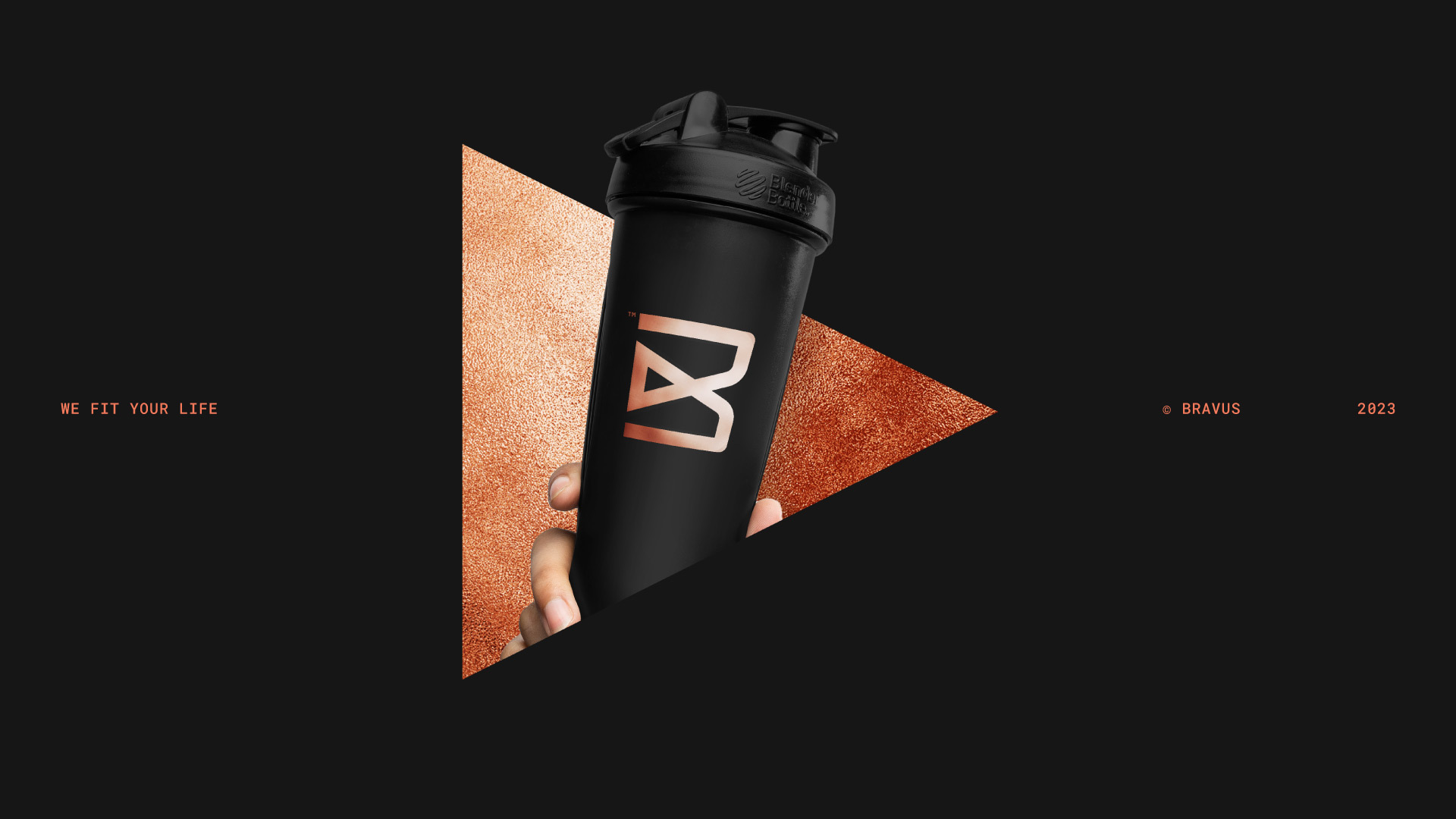
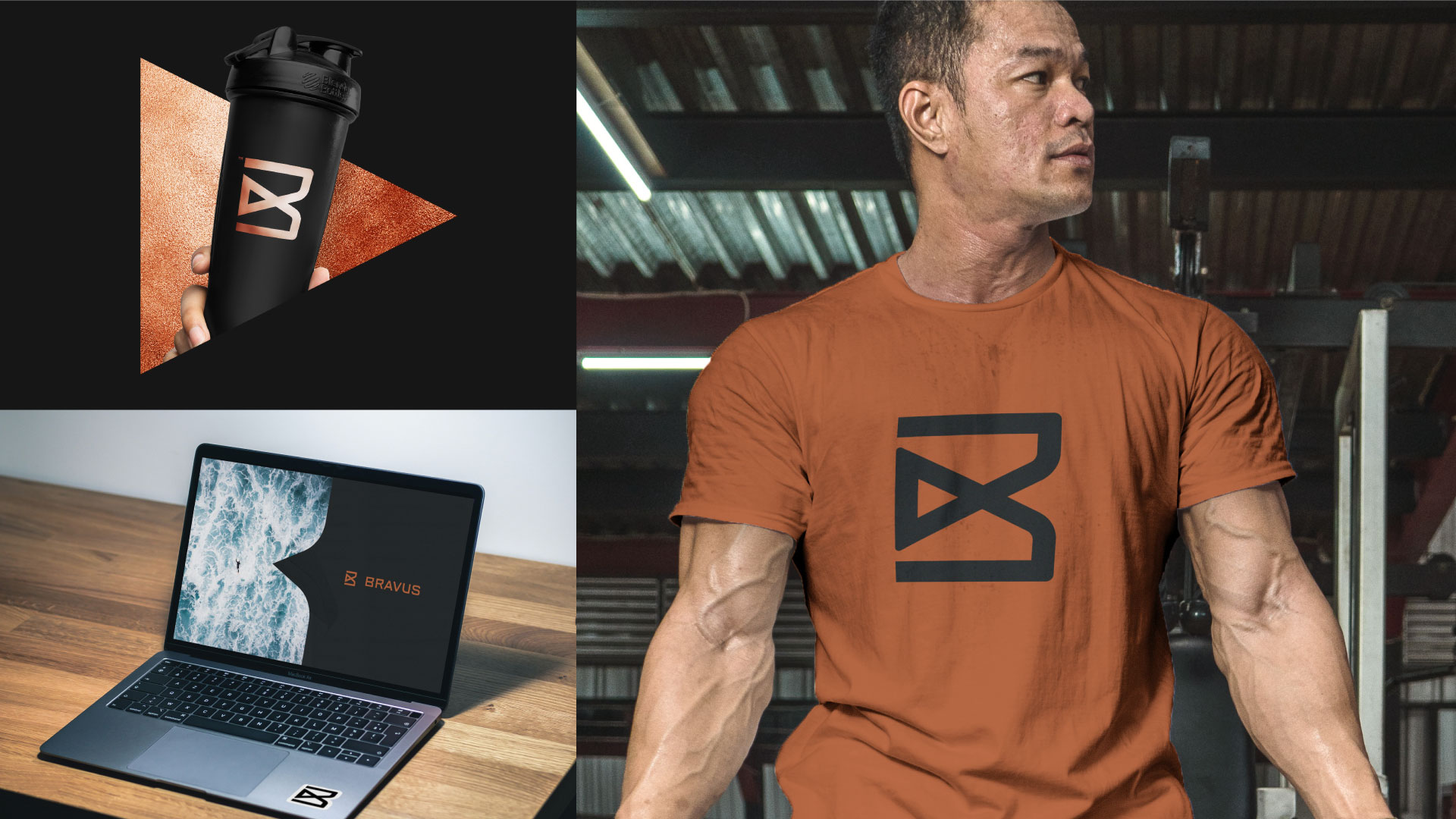
We want Bravus clients to feel proud to wear our apparel. We certainly are when we see them wear it. It’s an expression of tribal enrollment, a deep connection to Bravus and what the brand stands for.
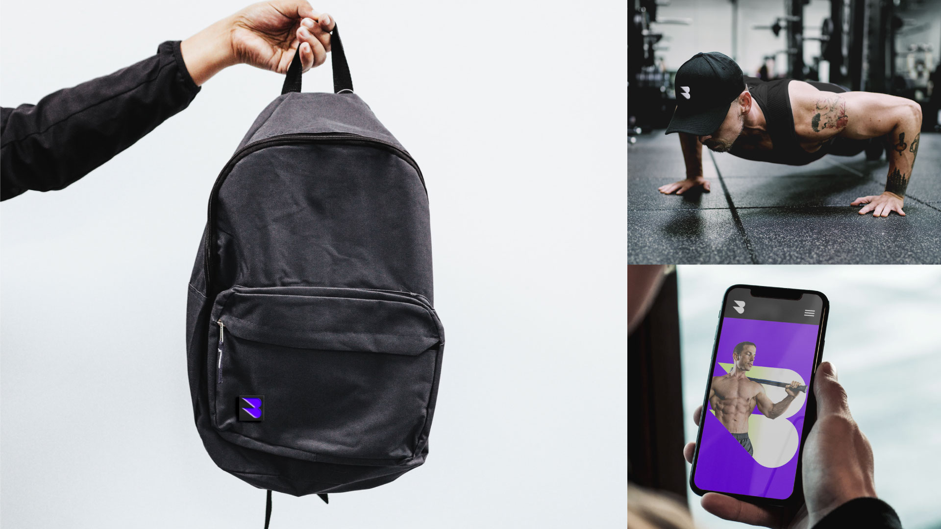
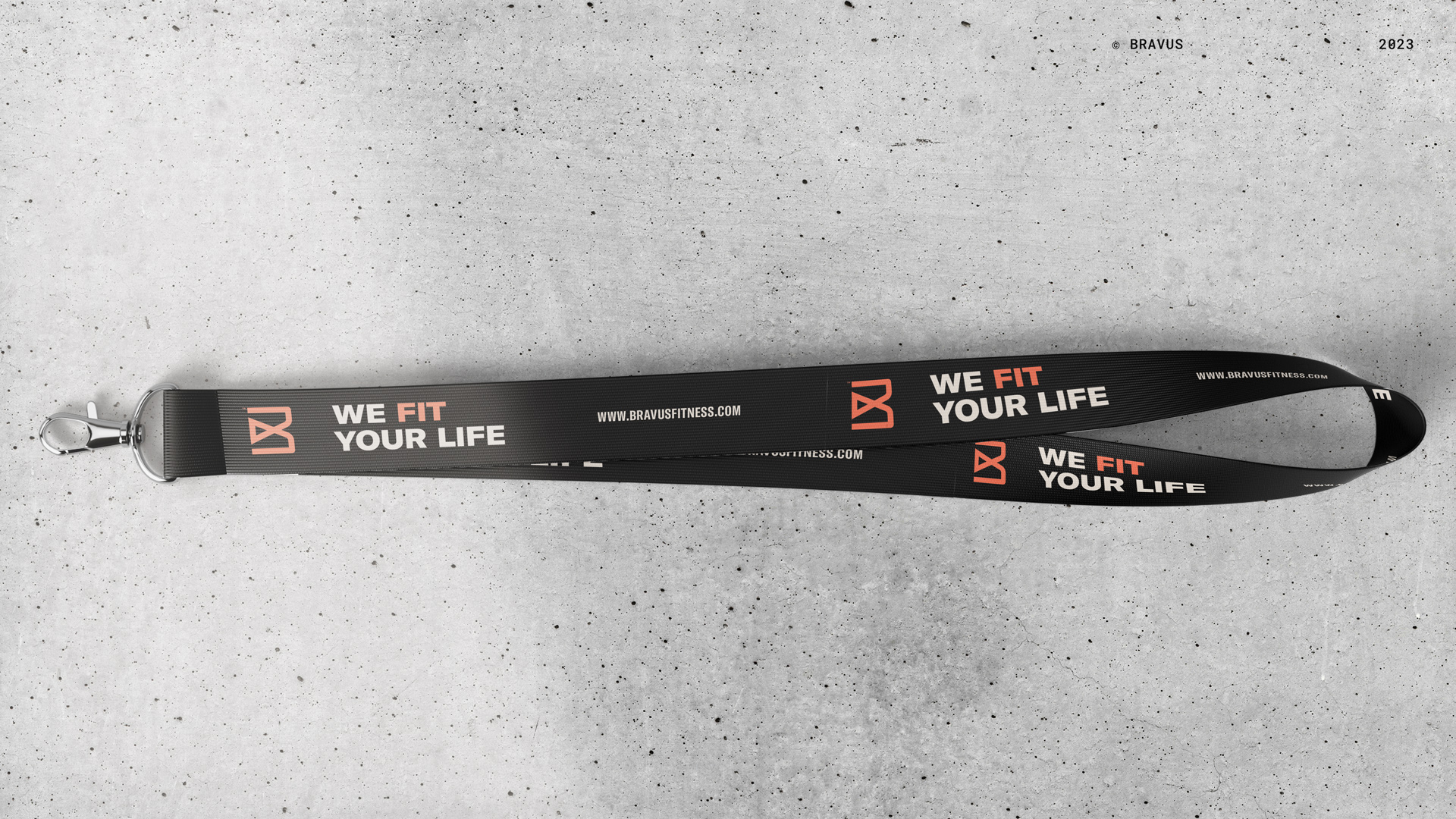
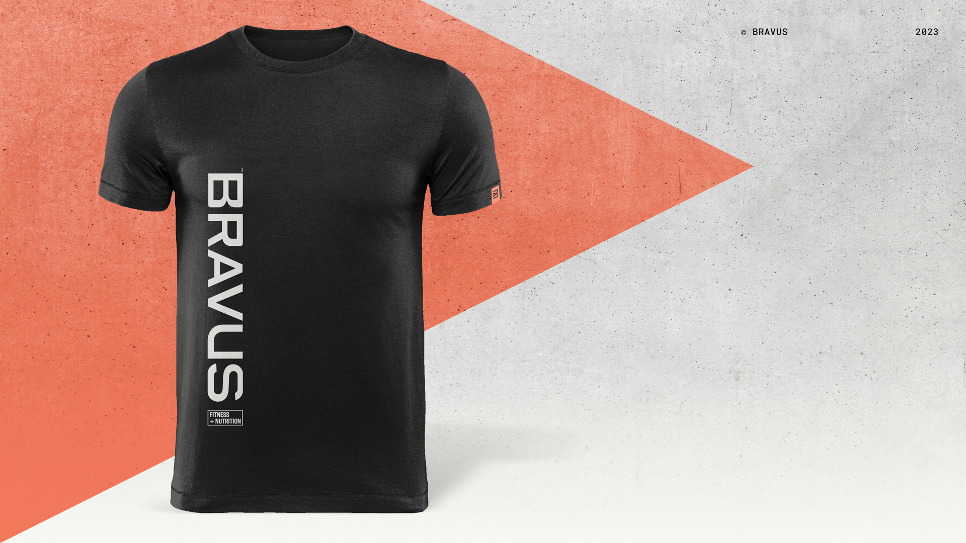
Groundwork created introductory apparel to be flexible and create strong brand impressions for Bravus.
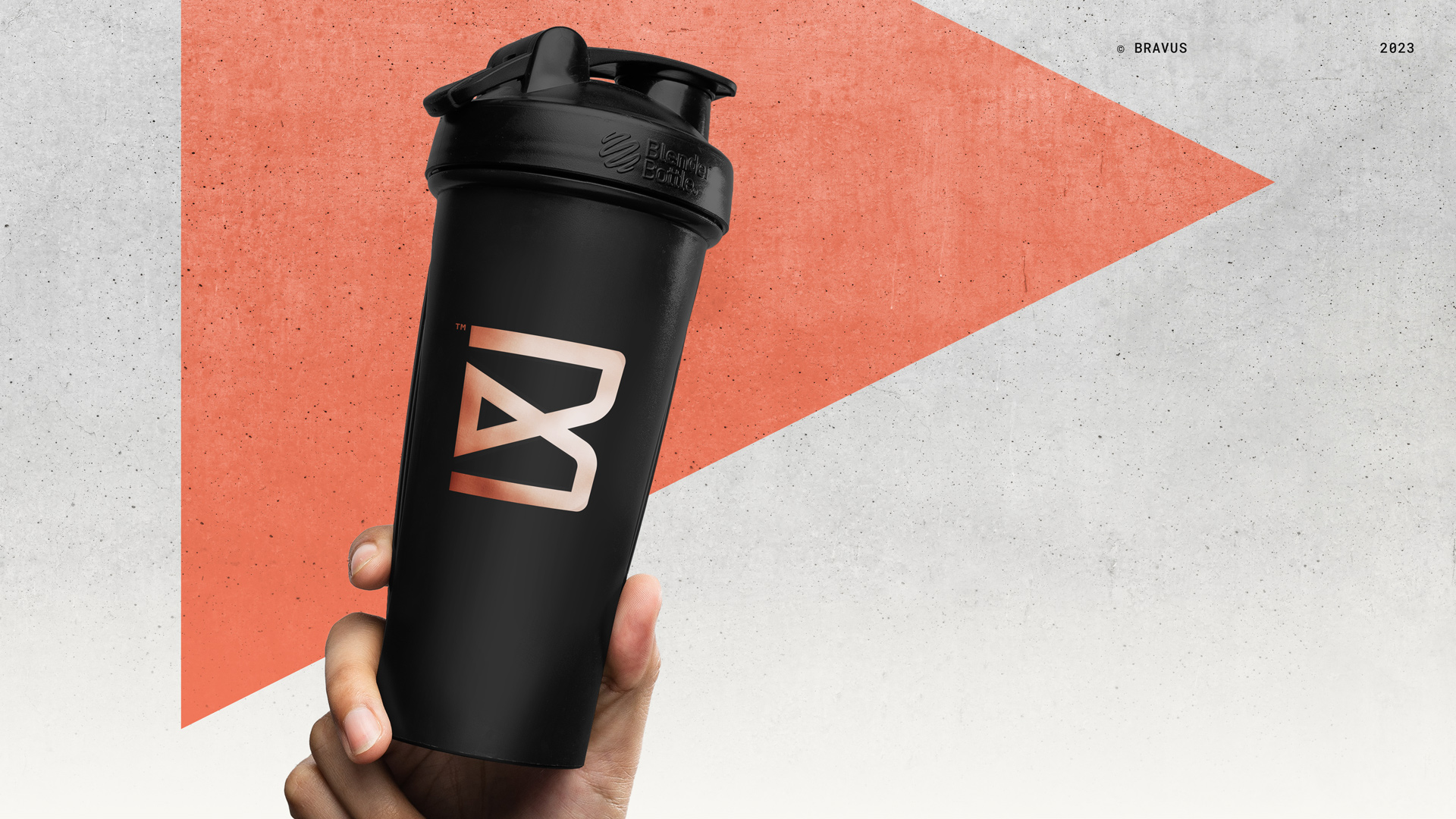
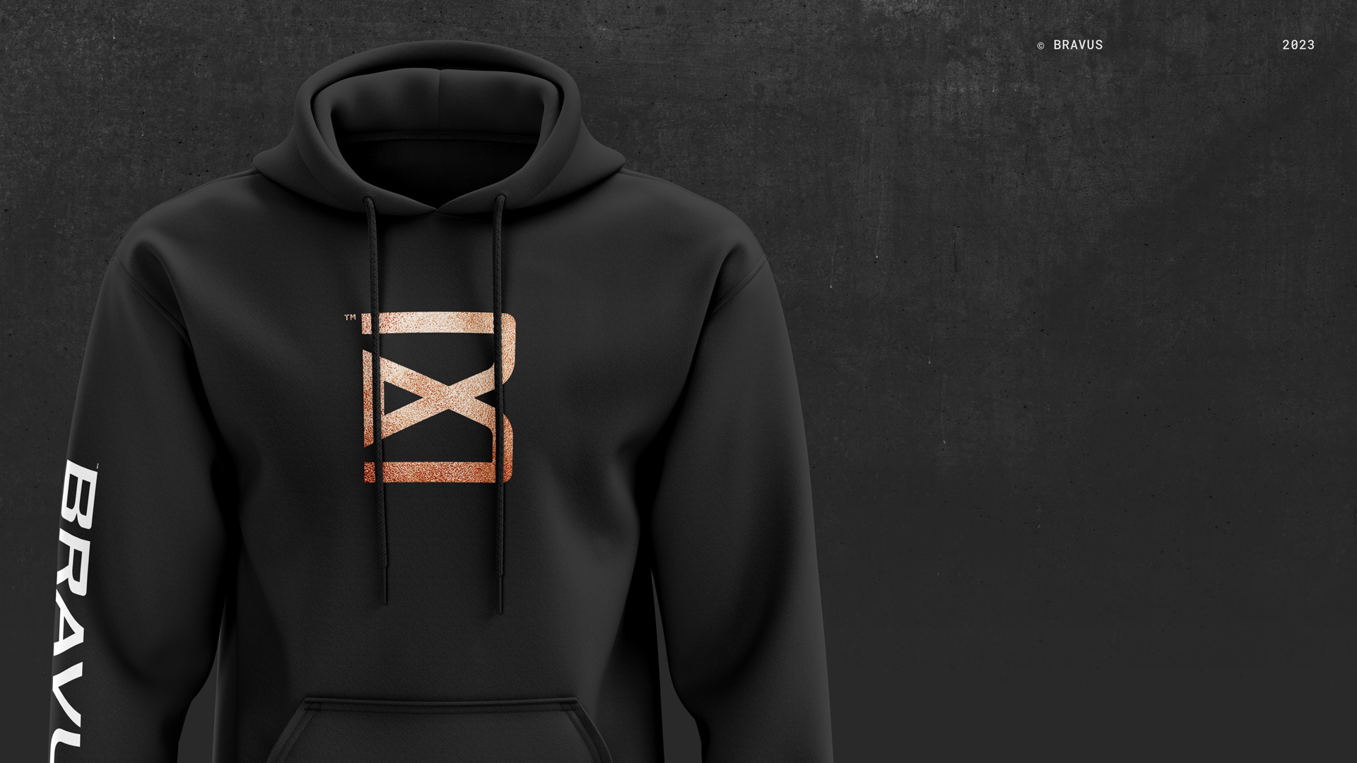
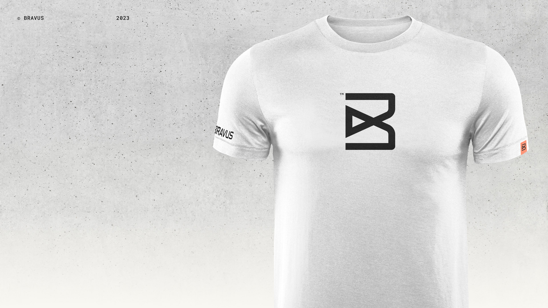
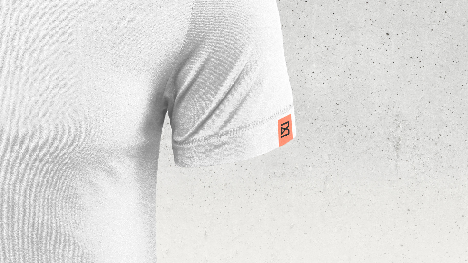
The Bravus apparel tag element is attached to the left sleeve or bottom left hemline of brand apparel, making the product line feel “cut from the same cloth.”
04. Social Media & On the Web
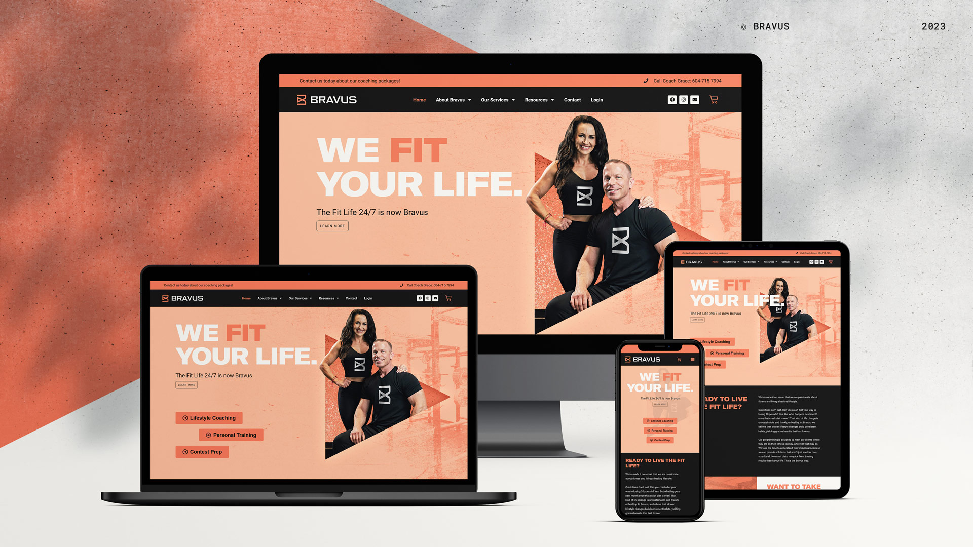
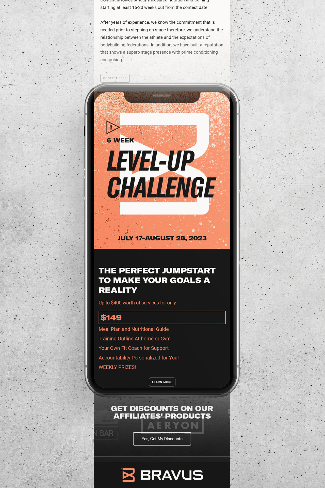
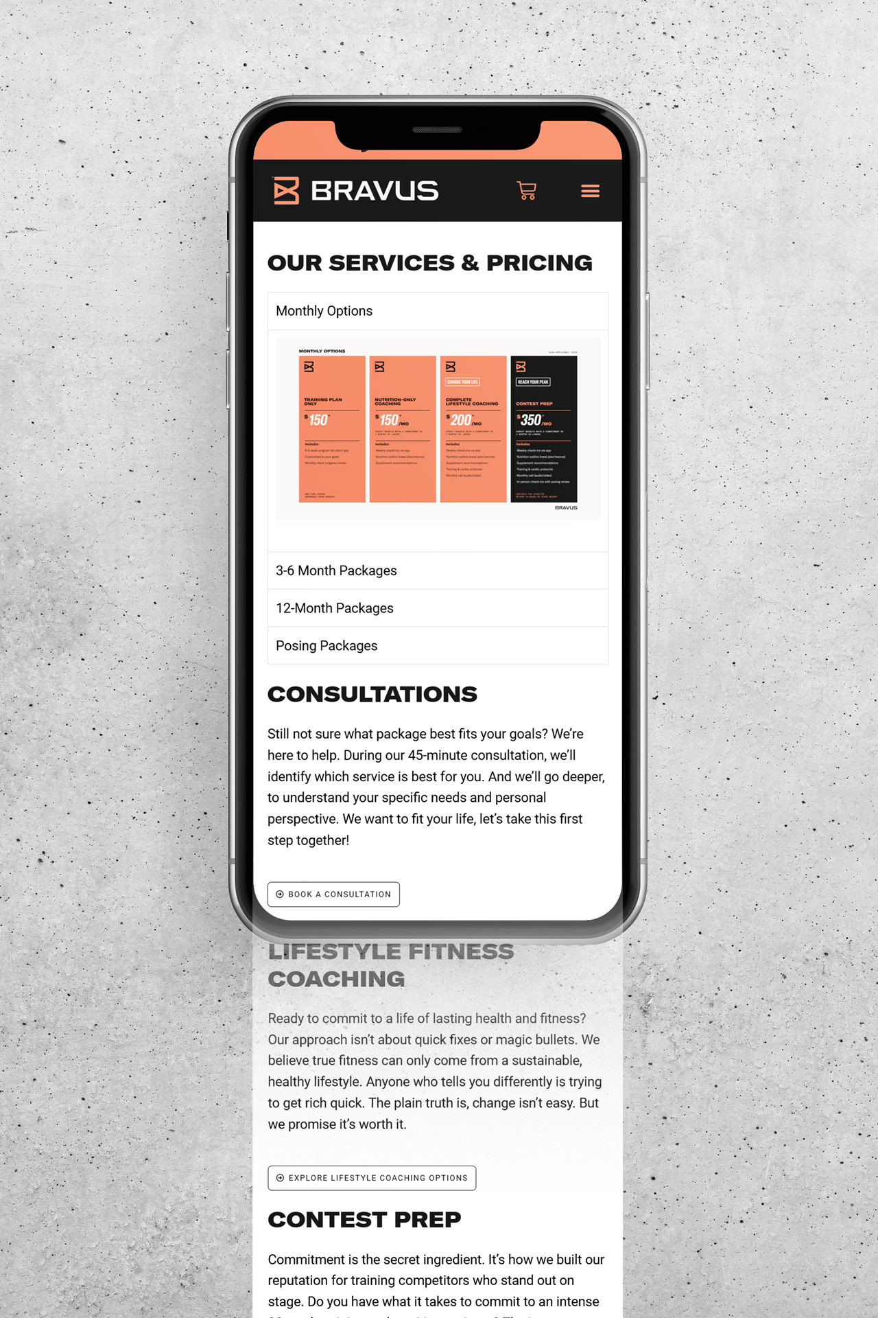
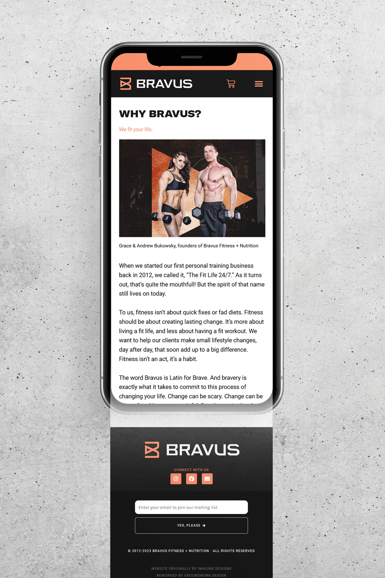
Groundwork refreshed the Bravus website, updating it with new content and imagery. The result is a more engaging experience worthy of the Bravus name.
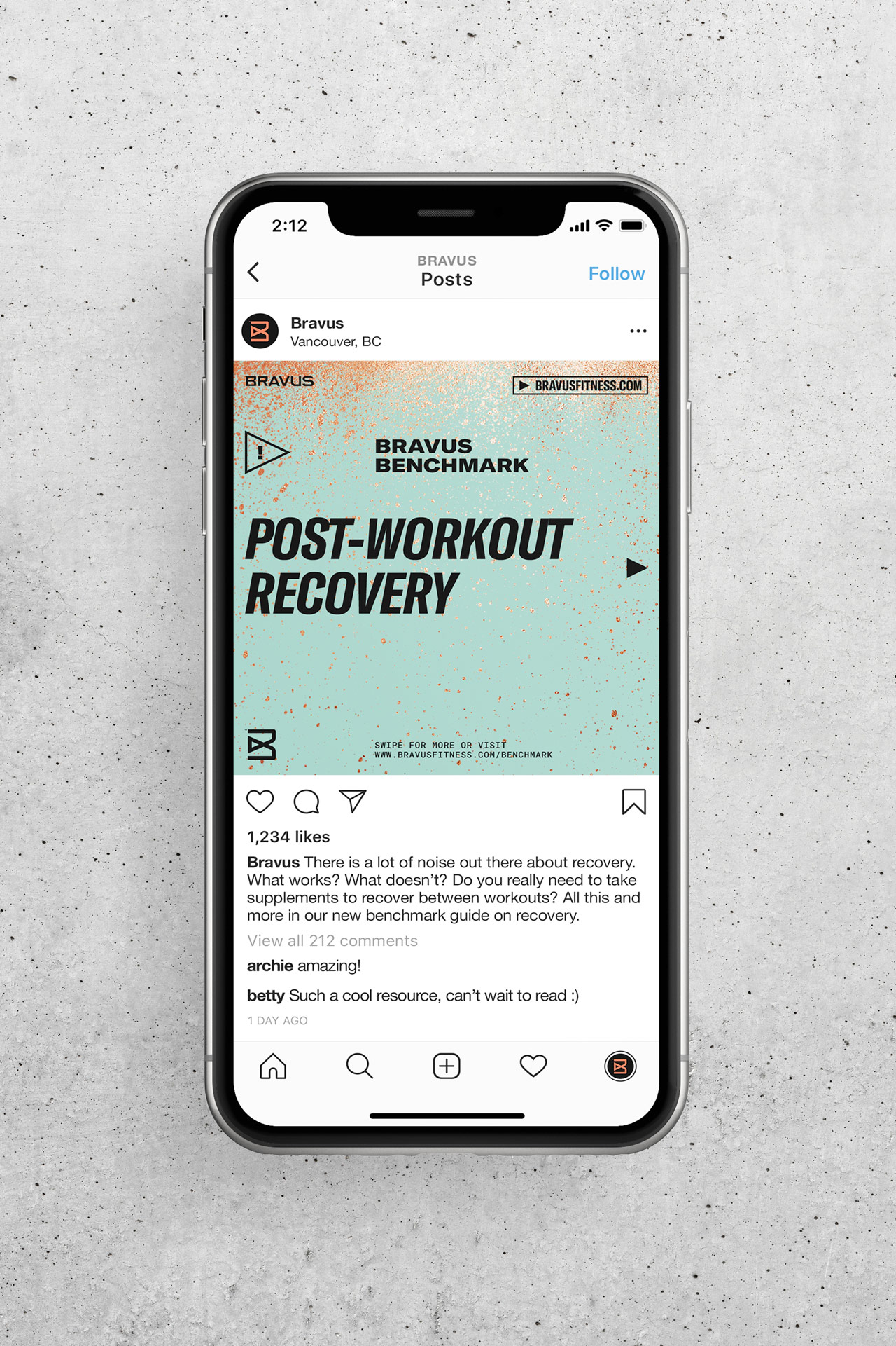
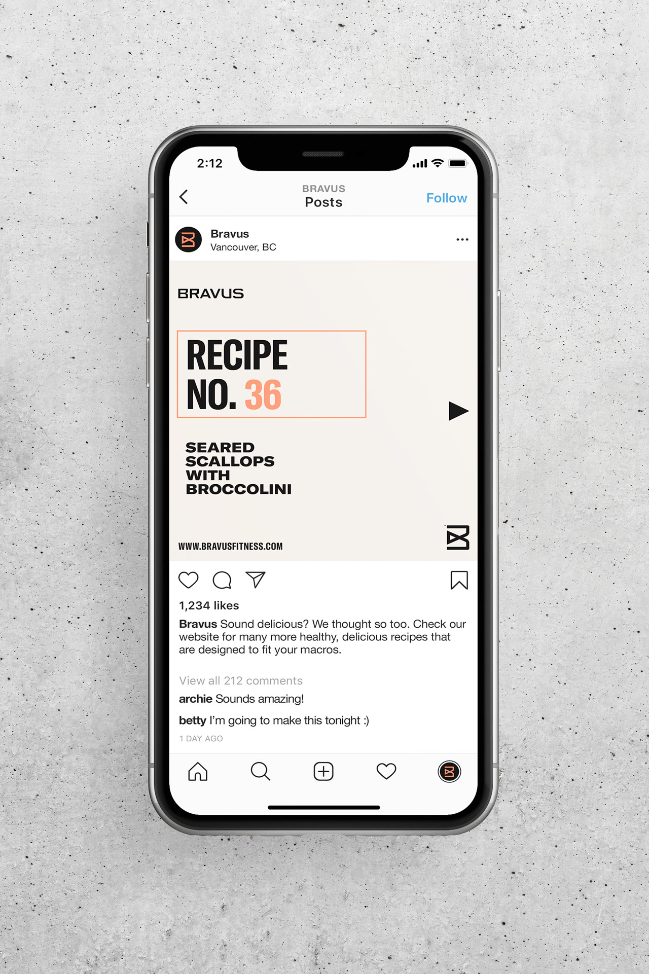
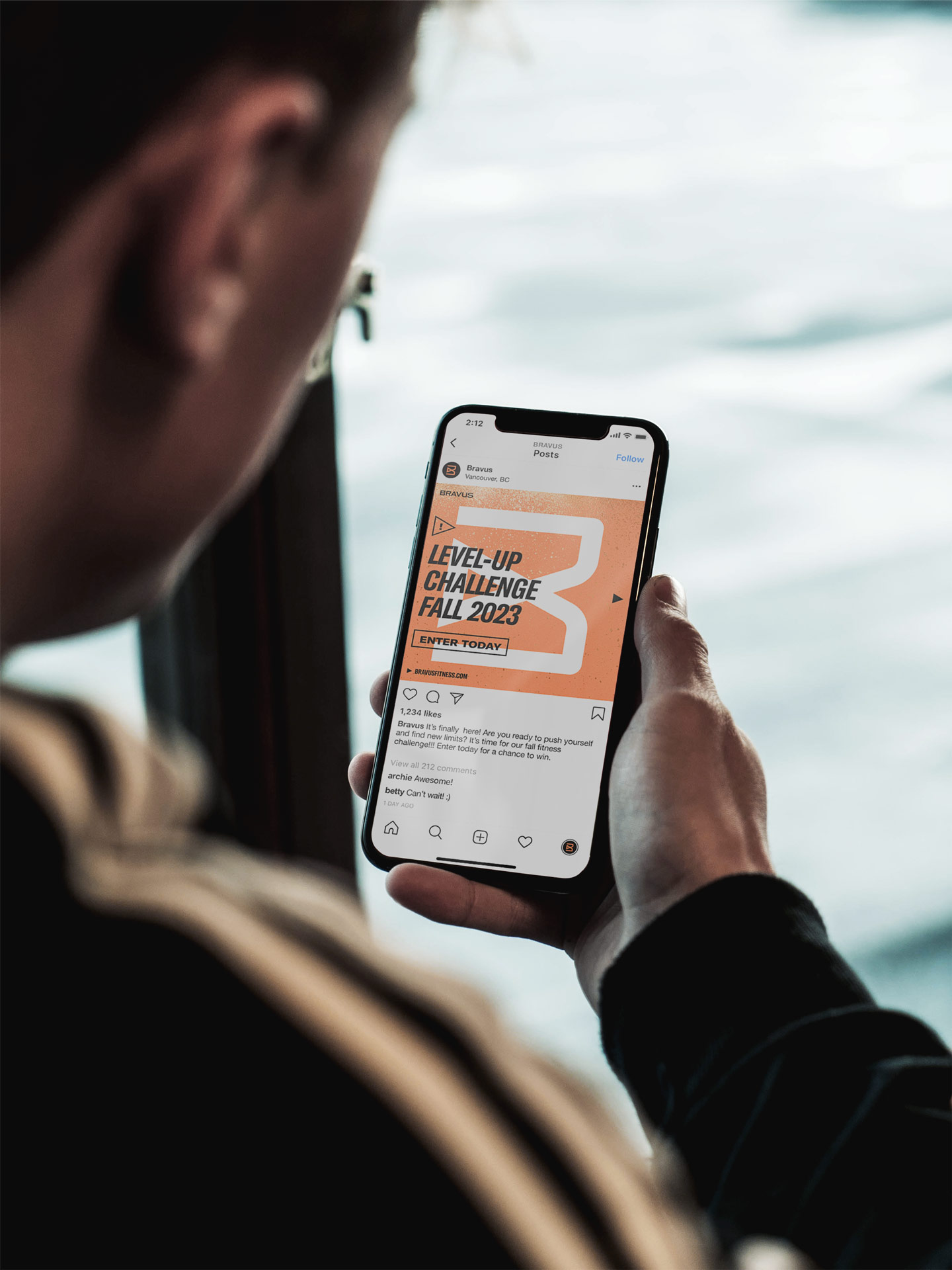
Promoting and growing Bravus through social media was a significant focus of the project. New Instagram content types and templates make implementation smooth. Combined with other assets, they also serve as a starting point to build future content.
Social Media
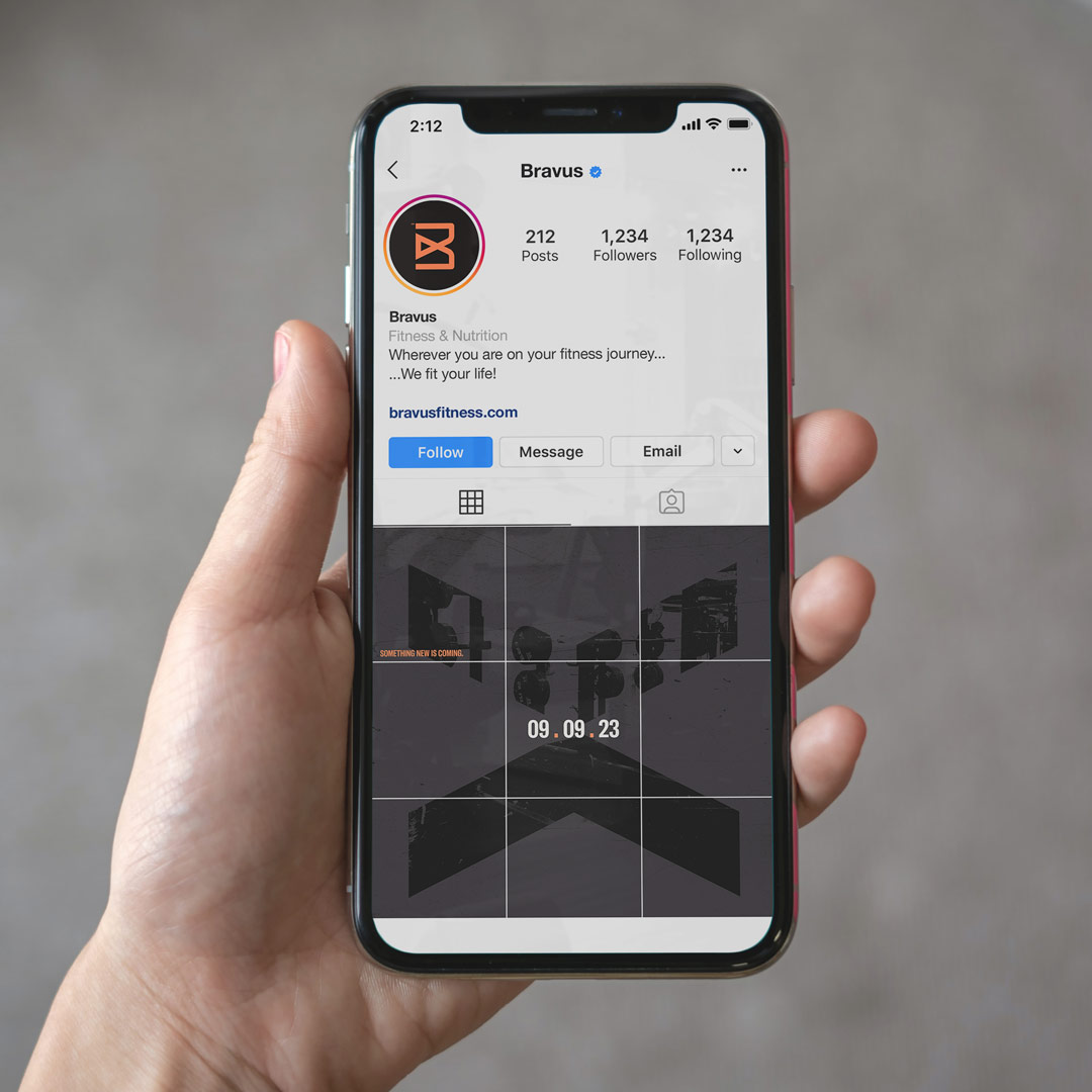
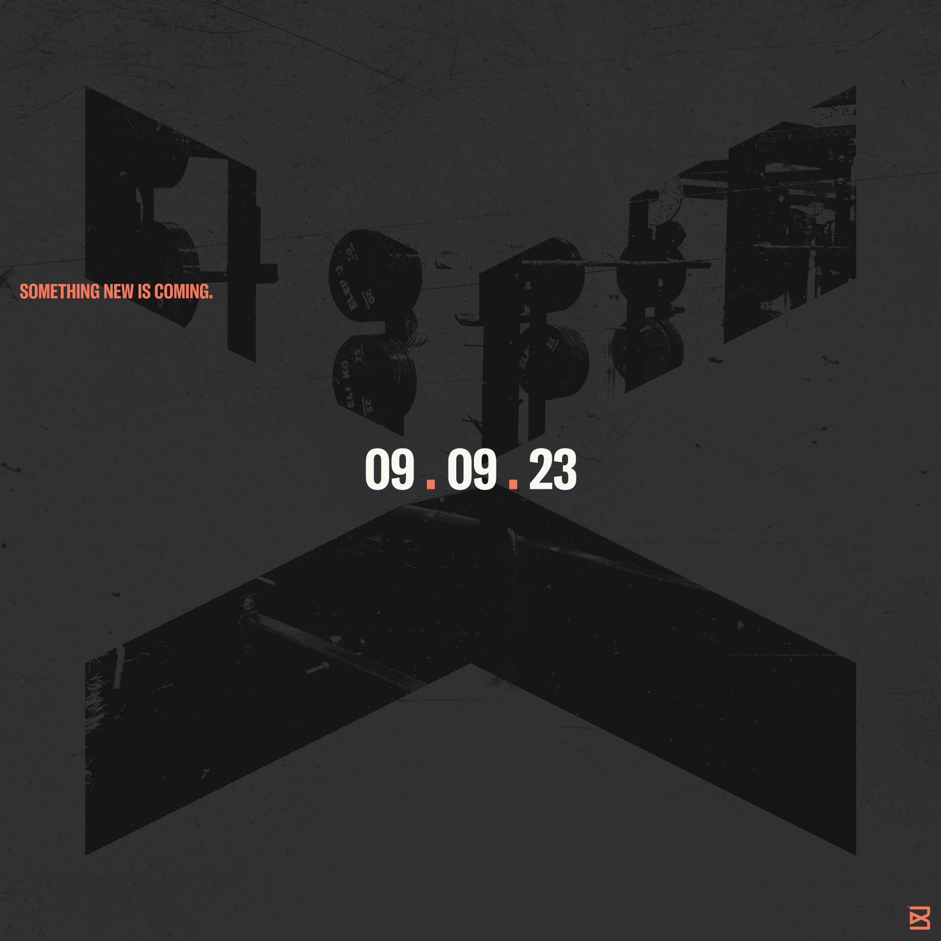
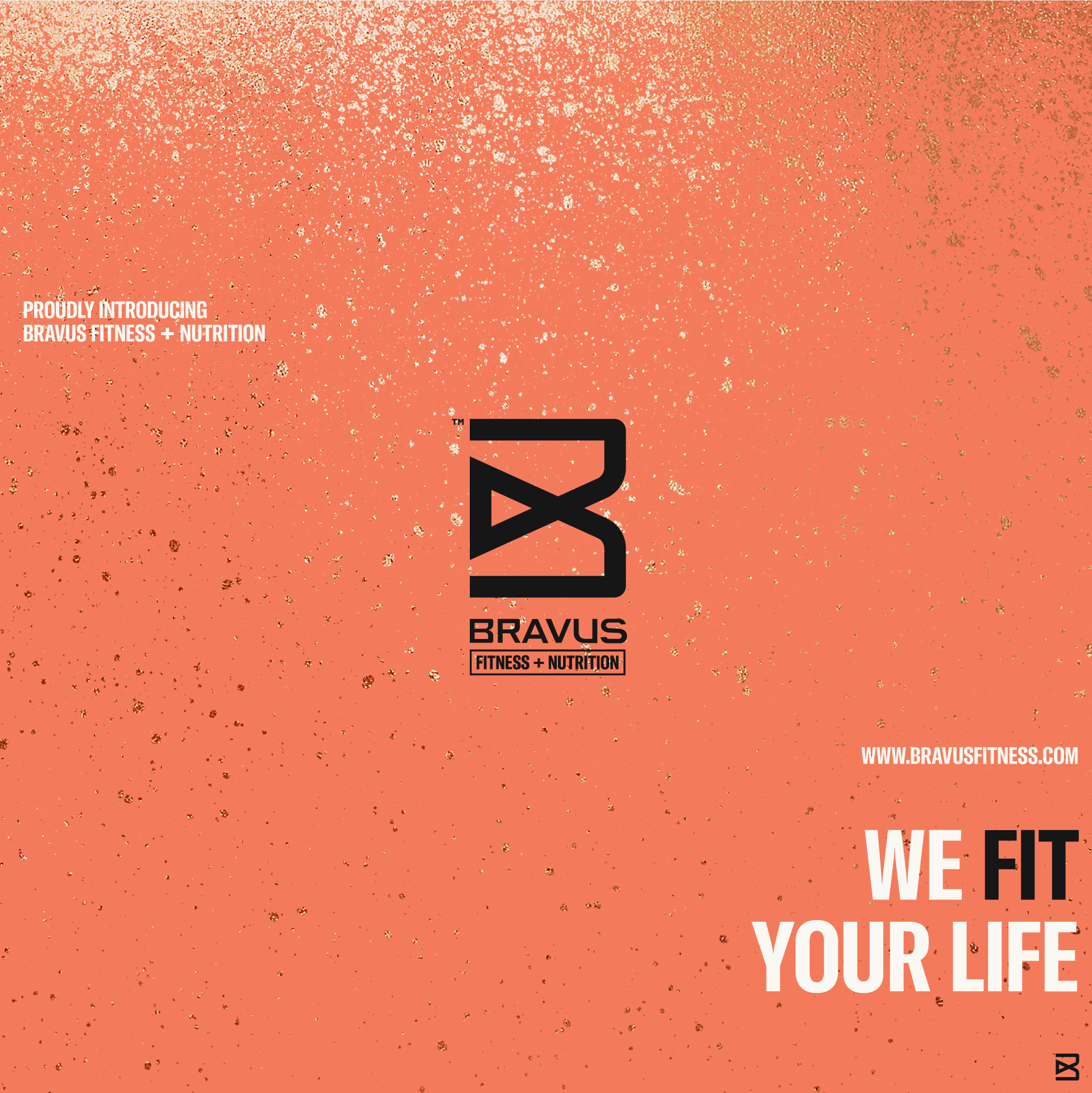
Instagram teaser & reveal post series separated the old Fit Life 24/7 and new Bravus brands, smoothing out the launch process. They built anticipation to give Bravus the gravity and attention it deserves.
Posts & Content
Bravus’ most important long-term goal is revenue growth. So, spreading the Bravus message through social media is vital.
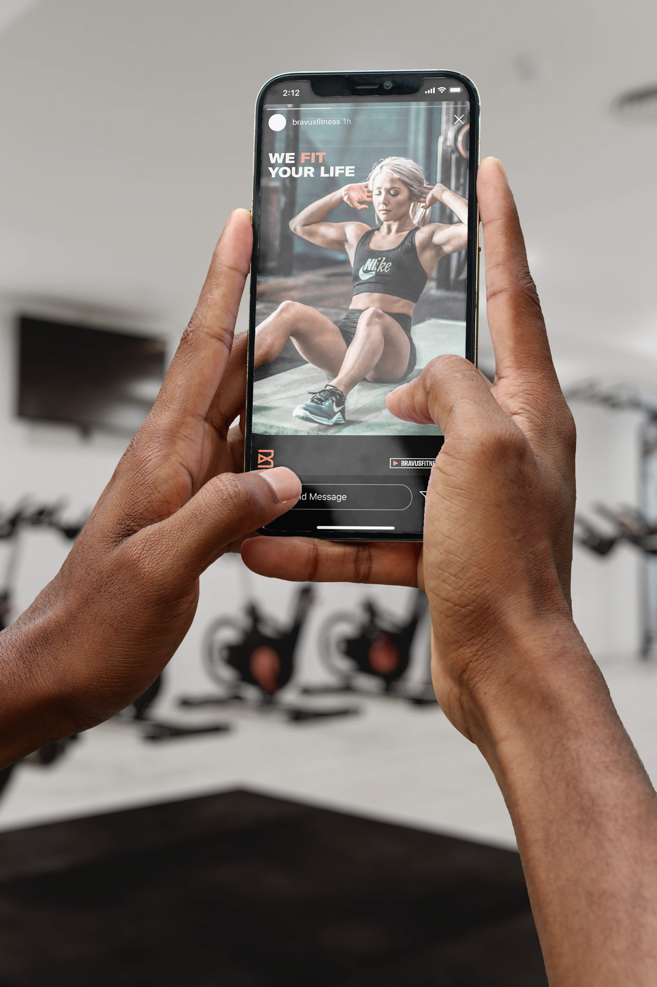
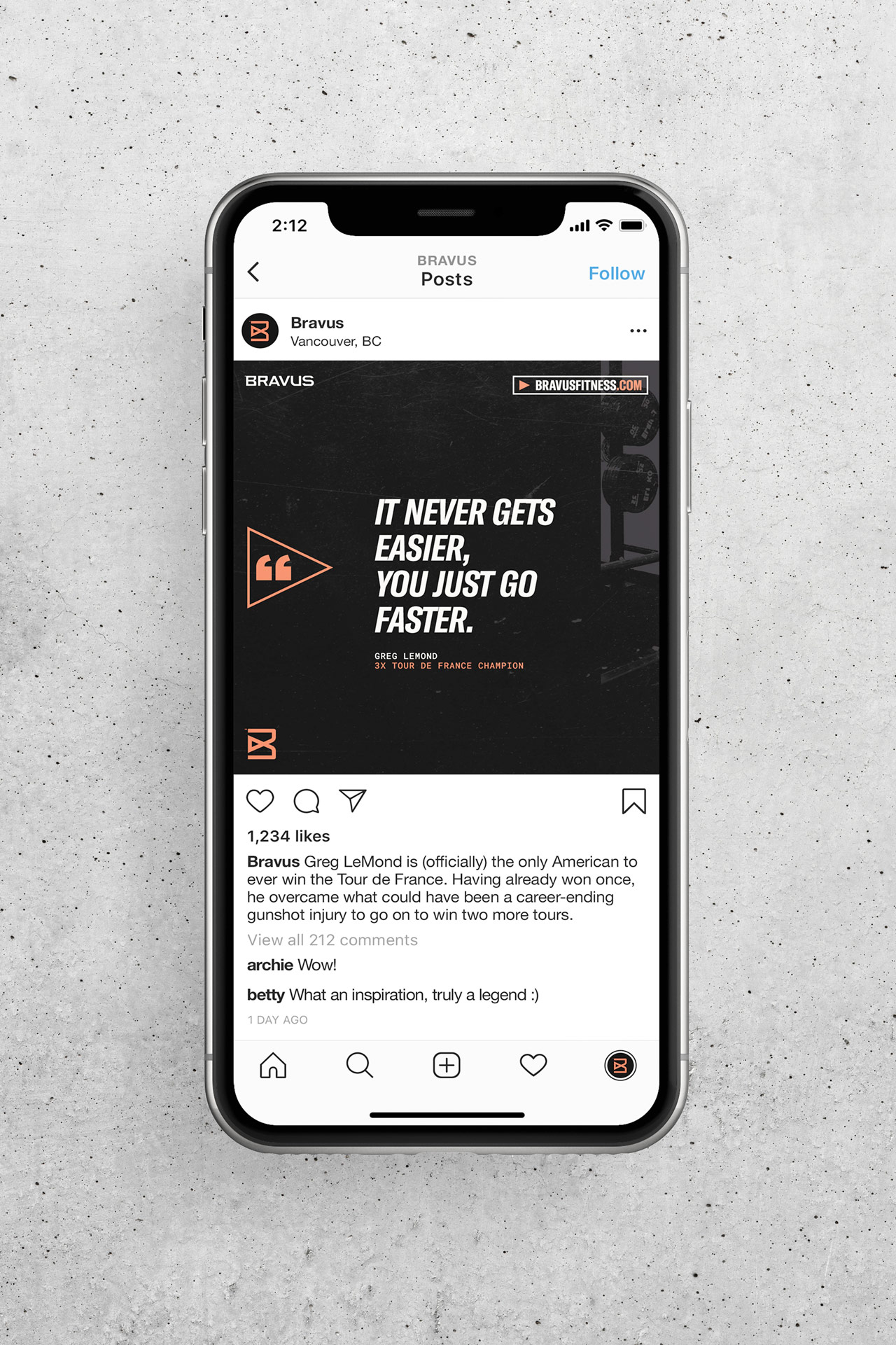
To make the transition from The Fit Life 24/7 to Bravus as smooth as possible, Groundwork created several social media post types and templates to generate recurring content.
Flexible layouts make it easy to reformat Instagram posts into stories and Facebook posts. Complete carousels help Bravus share additional information, drive website traffic, and boost email sign-ups.
What Grace & Andrew had to say
“The results are beyond words. This project has exceeded even our wildest expectations. We have never been more confident in the future of our business, and we’re excited to partner with Groundwork again on our next projects.”

Thanks for stopping by!
Thank you to:
Andrew and Grace Bukowsky, for trusting Groundwork with their most important asset—their brand. The staff at Bravus, for buying in. And most importantly, Bravus' clients, who have embraced change with open arms. You are the reason we do what we do.
More Projects
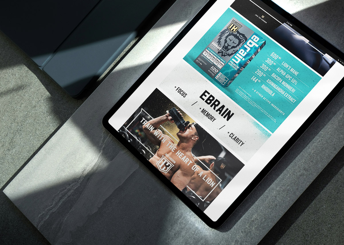
Iron Kingdom on AmazonMarketing Collateral
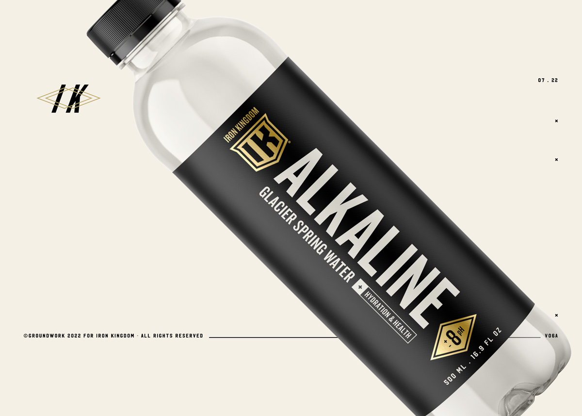
Iron Kingdom Alkaline WaterNew Product Launch, Brand Identity, Packaging Design
Athletic Alliance Sports NutritionNew Product Launch, Brand Identity, Packaging Design
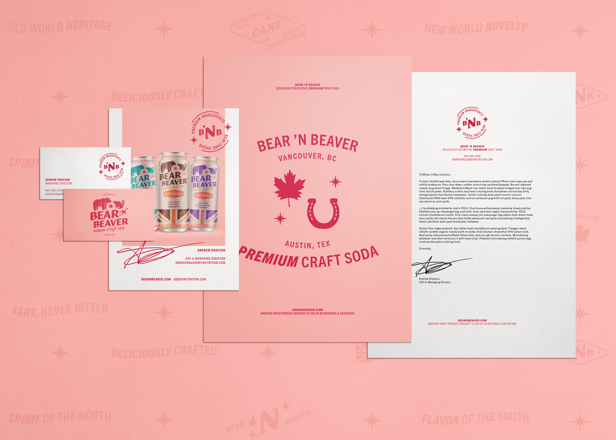
Bear ’n BeaverNew Product Launch, Brand Identity, Packaging Design
Grizzly SupplementsNew Product Launch, Brand Identity, Packaging Design
New Business
© 2024 Groundwork Design, LLC.